Blue Apron
Transforming an onboarding experience.
Description
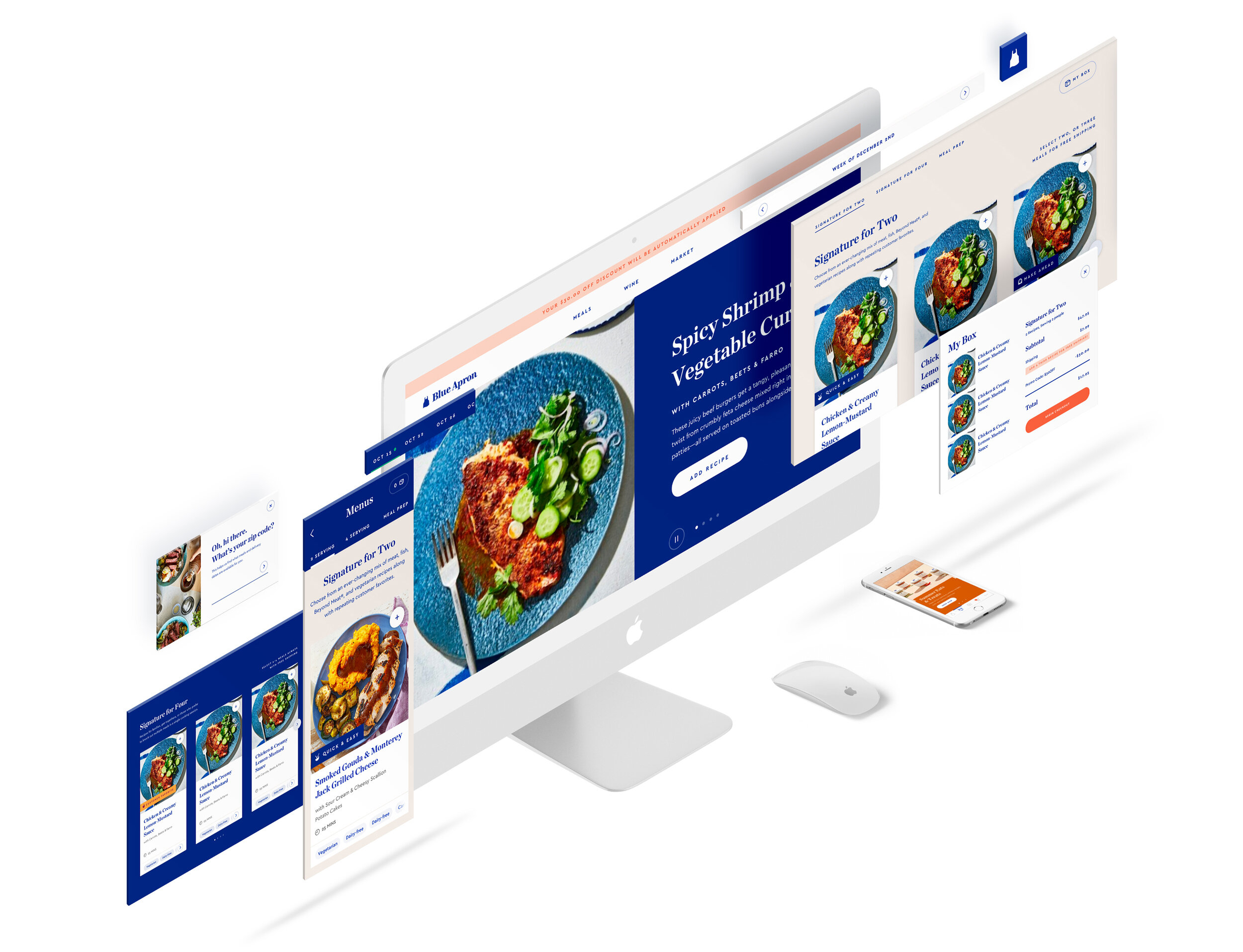
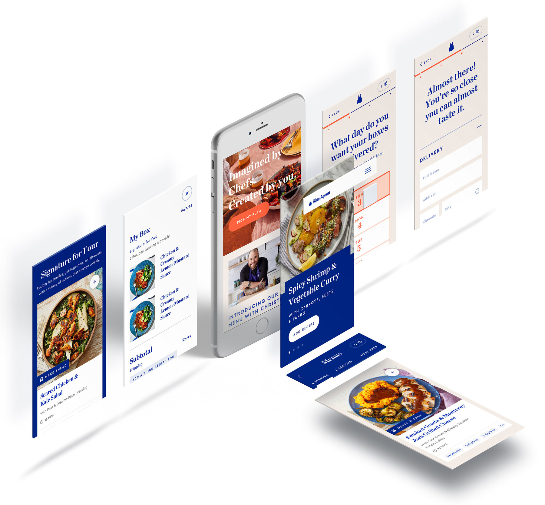
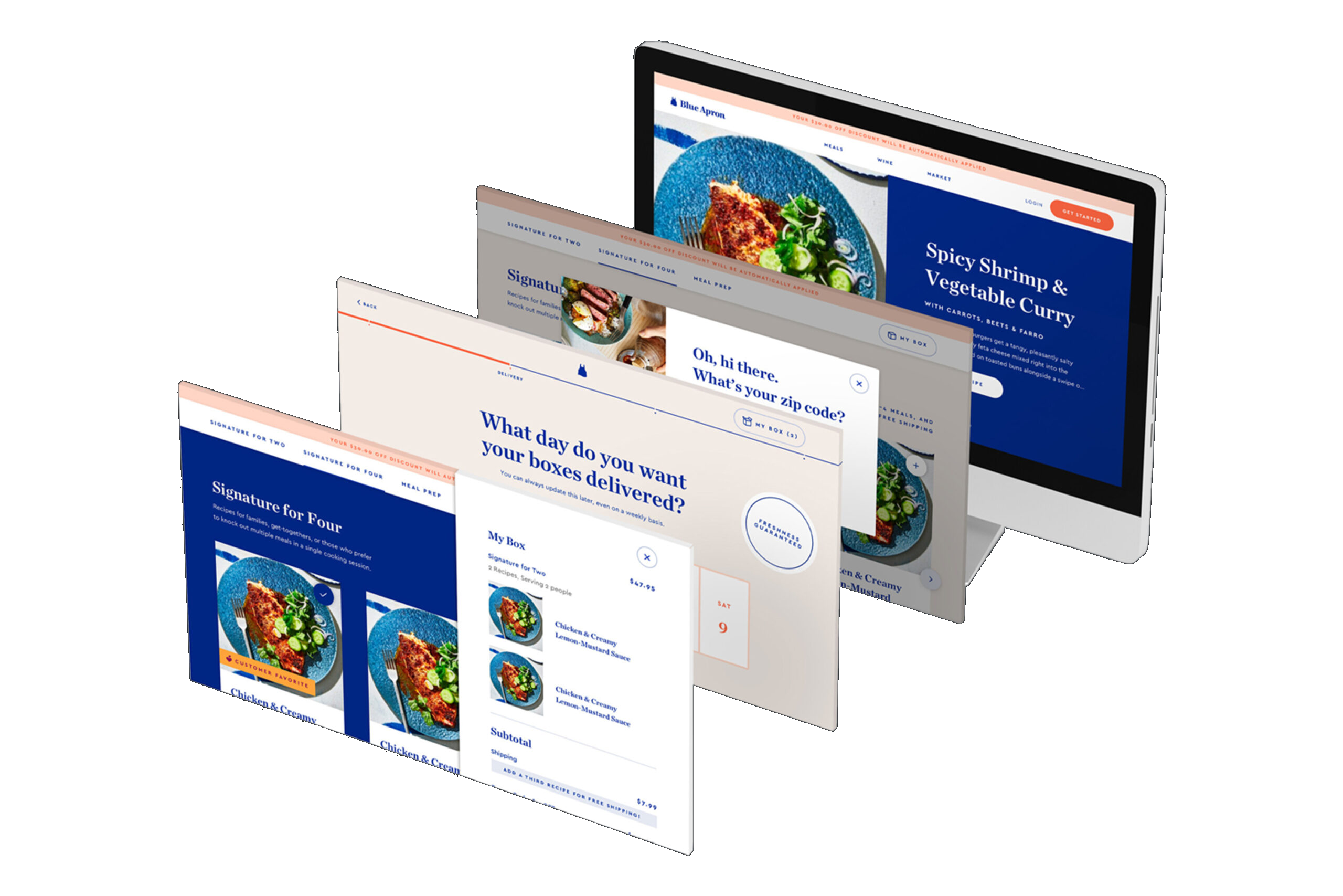
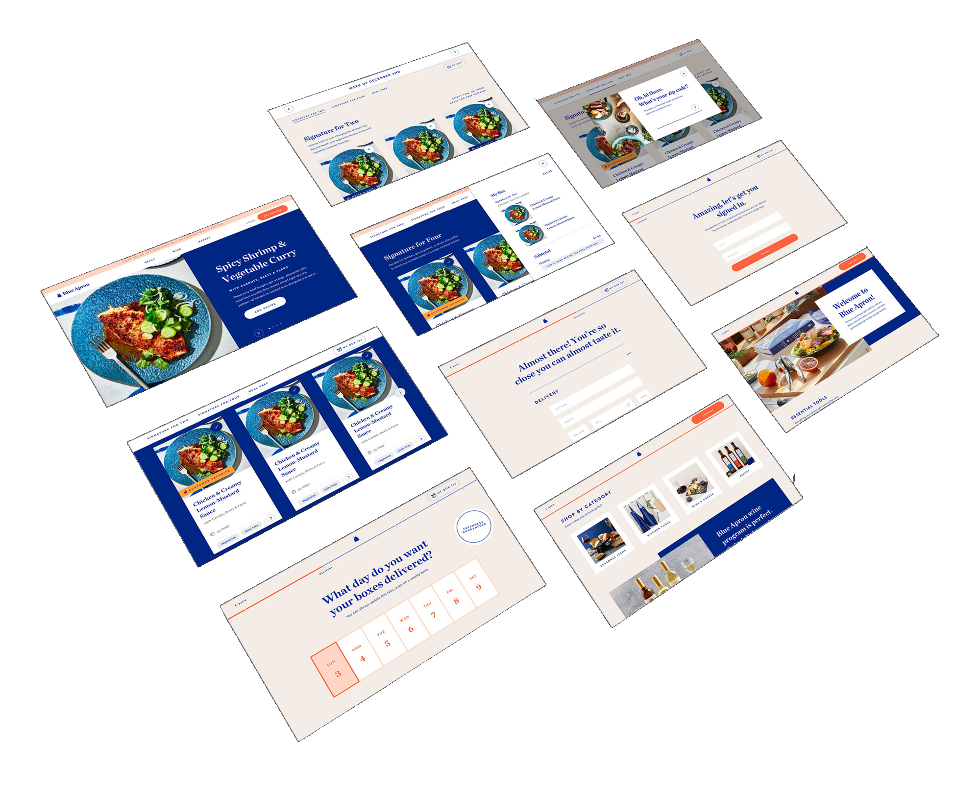
The transformation to the registration page aimed to increase revenue and decrease drop-off of loyal customers. A more fluid experience for the registration page was created by utilizing improved hierarchy, added education, and stronger segmentation of communication while presenting the Blue Apron brand in a more hospitable way.
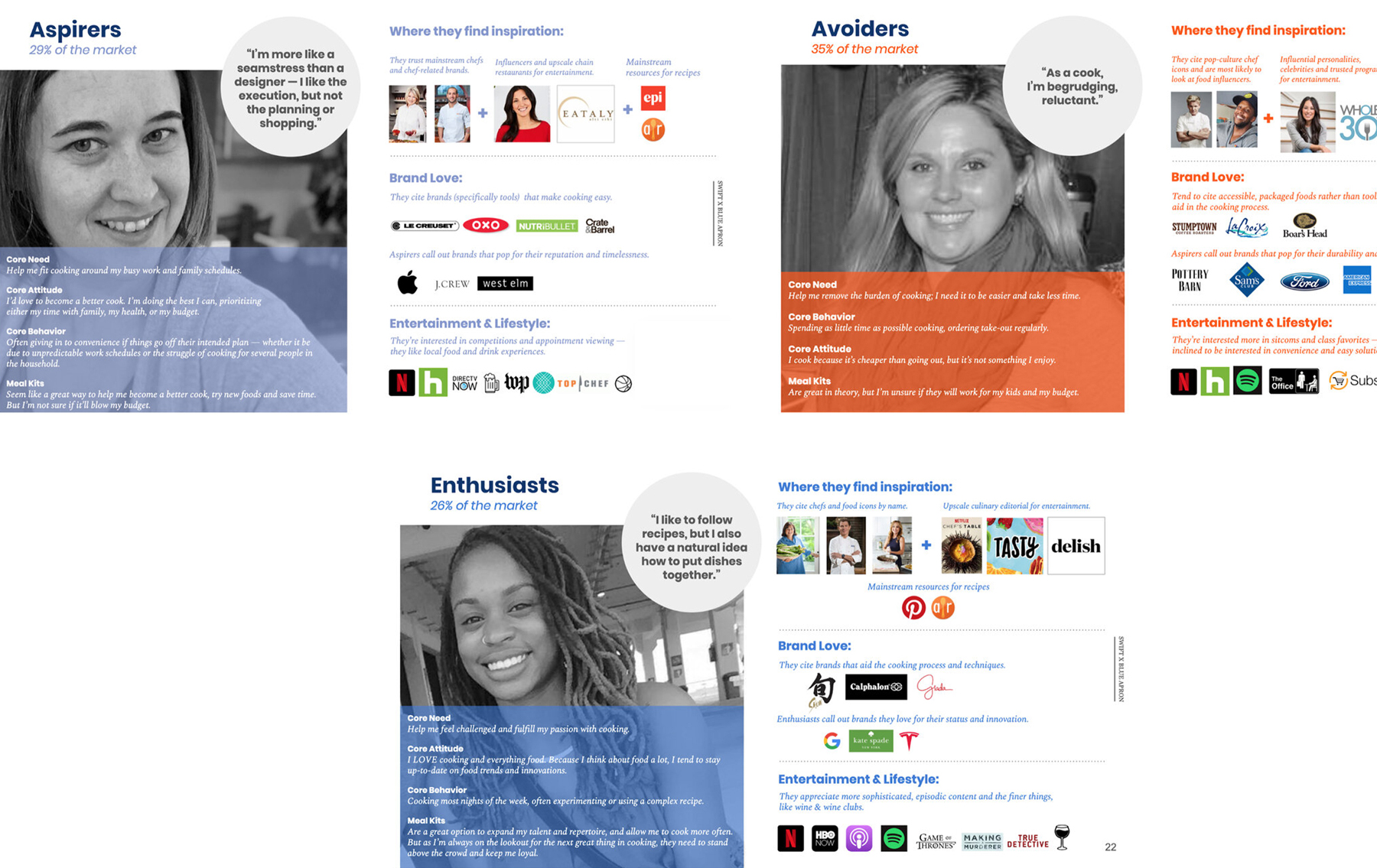
High-affinity customers
More established
Blue Apron's best customer skews heavily high-income, higher education and more female over 30.
Experience oriented
Blue Apron's customers are loyal to brands that allow them personal control and deliver a high-end experience.
Discovery and novelty seekers
Blue Apron's customers seek novelty and new learning opportunities.
Premium and natural
Blue Apron's best customers admire brands that promote a sustainable, more natural lifestyle.
Key issues
Flow presented in an unintuitive and backwards organization by having the meal selection and dietary restrictions after payment.
Disorganized flow of information and lack of hierarchy resulting in an overwhelming experience.
User confusion around product offering and what they are signing up for.
Personal information is required before any explanation of product offering is presented, resulting in a high drop-off.
Acquisition initiatives drop users into checkout flow without product education or selection.
Lack of branded content that encourages users to see themselves with the product, facilitating a sense of FOMO.
UX concepts
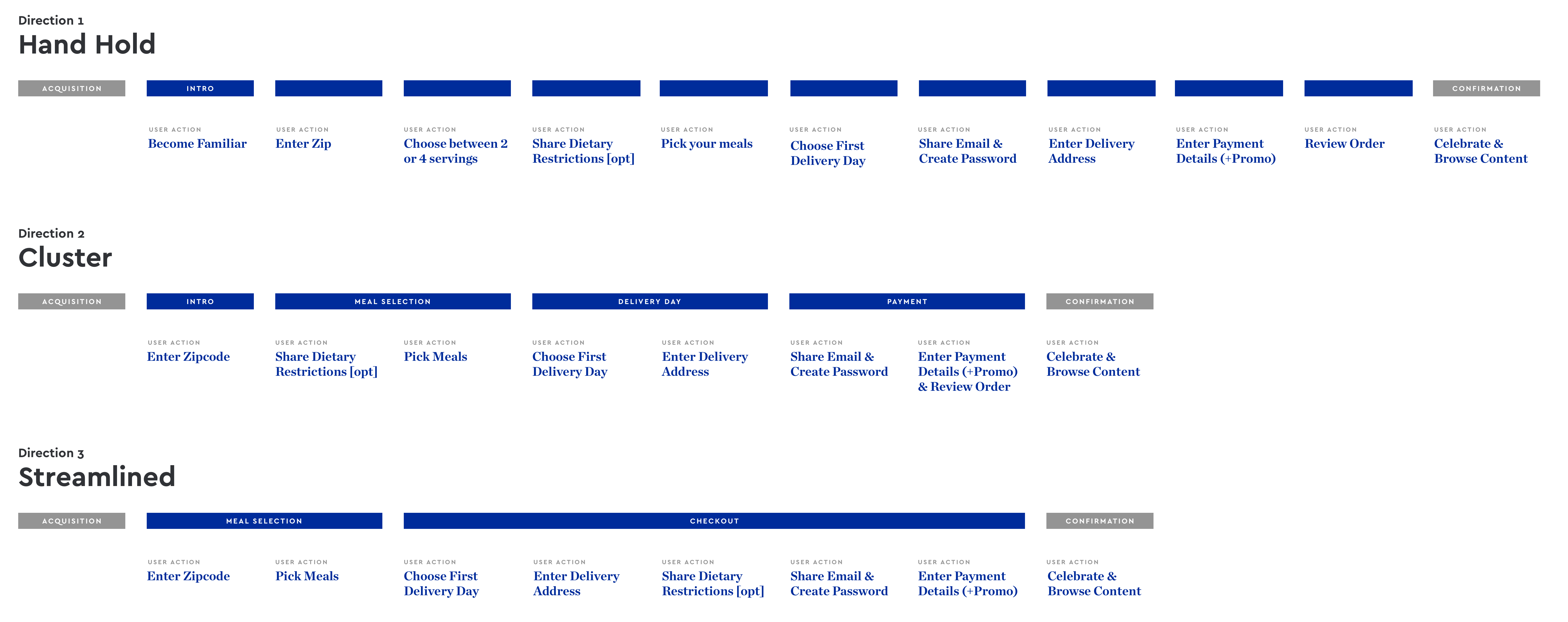
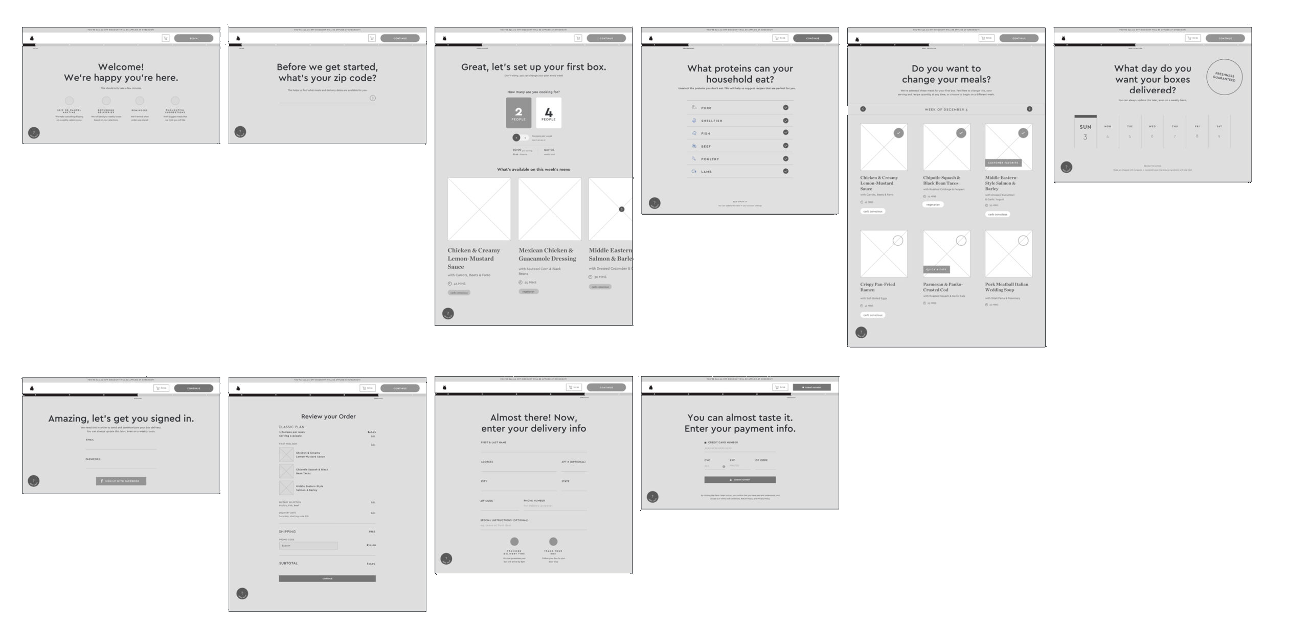
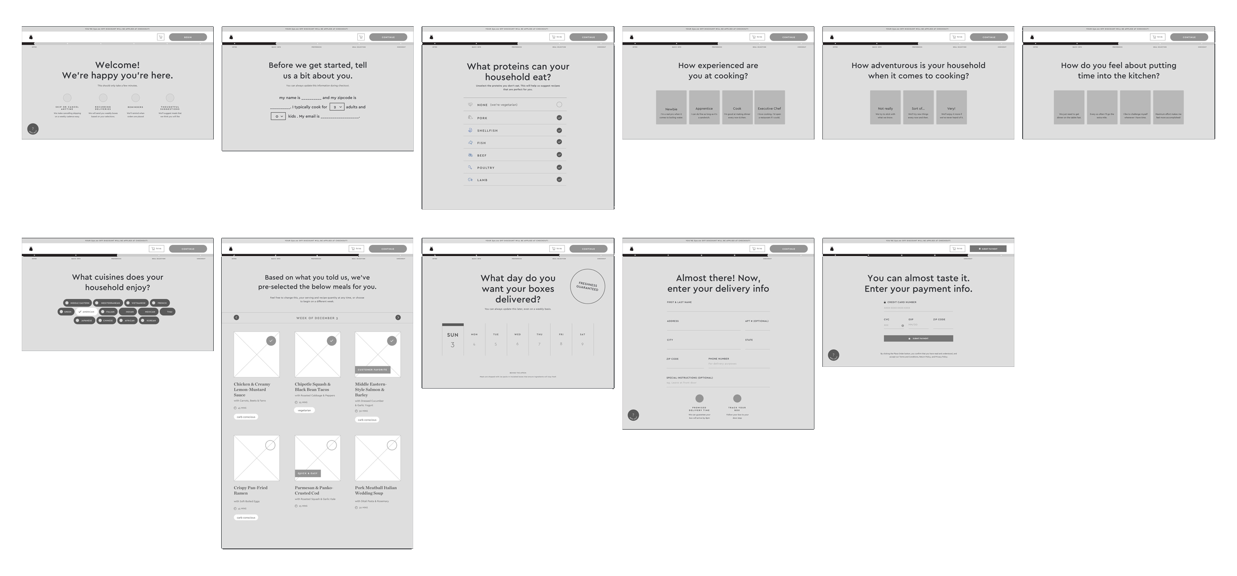
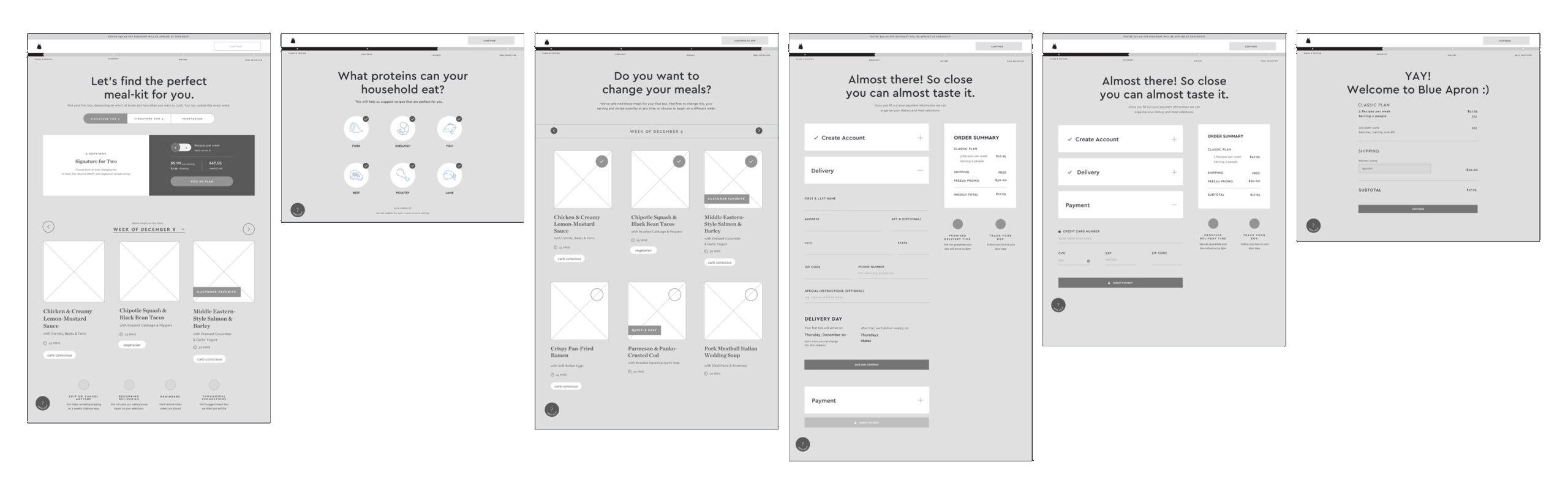
The first concept was high-education and high-experiential to determine how much hand-holding users appreciated. The second flow introduced a clustered approach of the screens from the first concept, and also highlighted preferences. The third concept represented a low-education experience that is reminiscent of familiar e-commerce checkout flows.
Hand-hold
Cluster
Streamline
Qualitative user research
The goal was to receive as many signals as possible as to how people felt at different parts of the flow. The findings proved the hypothesis correct that users want more product education, prefer a more hospitality-focused registration, and respond well to familiar e-commerce interaction models. Additional iteration enabled the ability to combine successful parts of all three concepts into one flow.
Homepage & Meals page
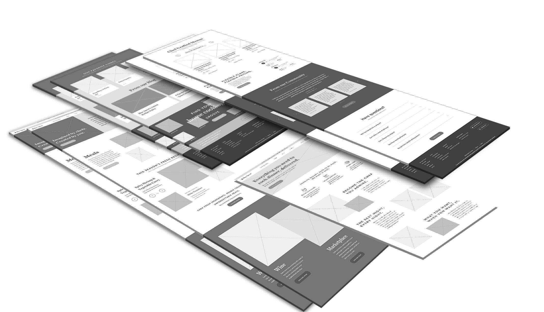
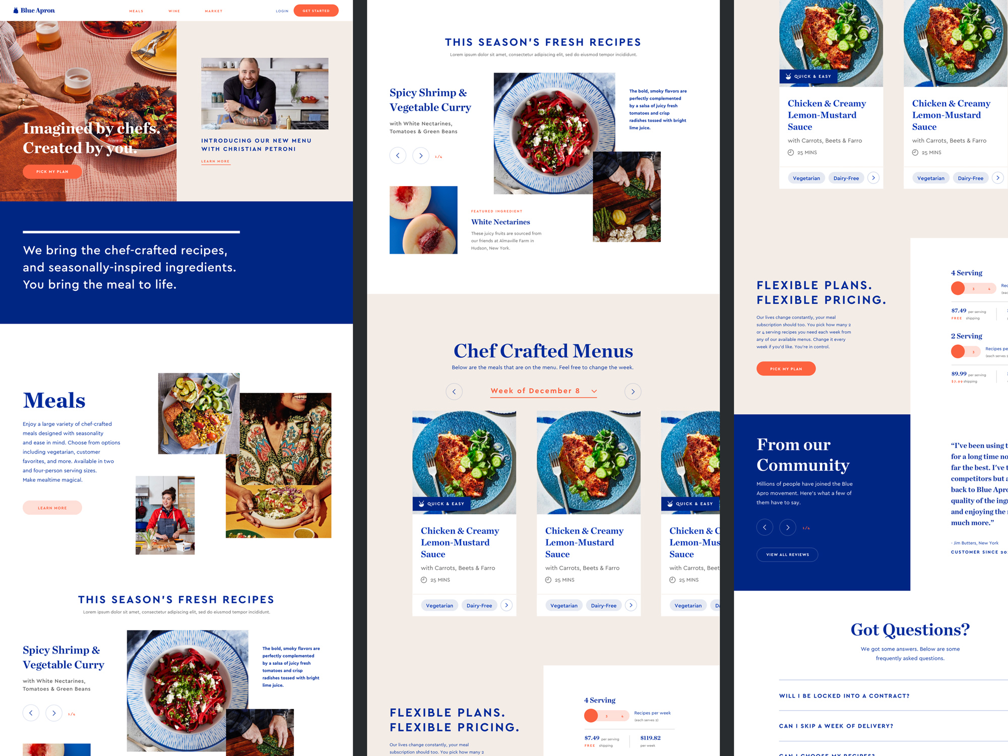
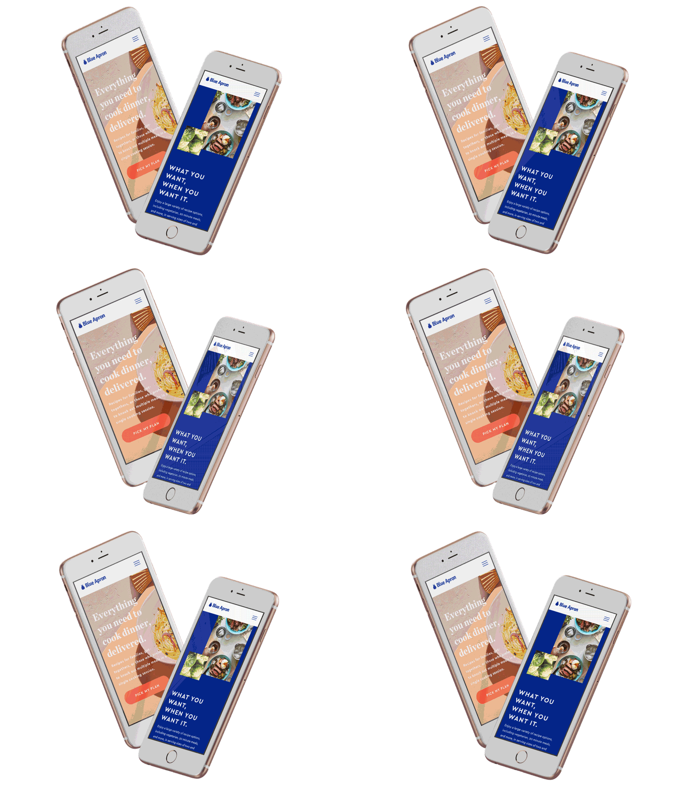
The homepage serves as a launch pad into all product offerings and the latest and greatest happenings. The Meals page serves as a web page for potential meal subscription customers to educate and inspire them about the Blue Apron offering. Based on CX tickets and qualitative sessions, it was revealed that users visit Blue Apron's site and don't understand the company's mission and offerings.
The discover experience
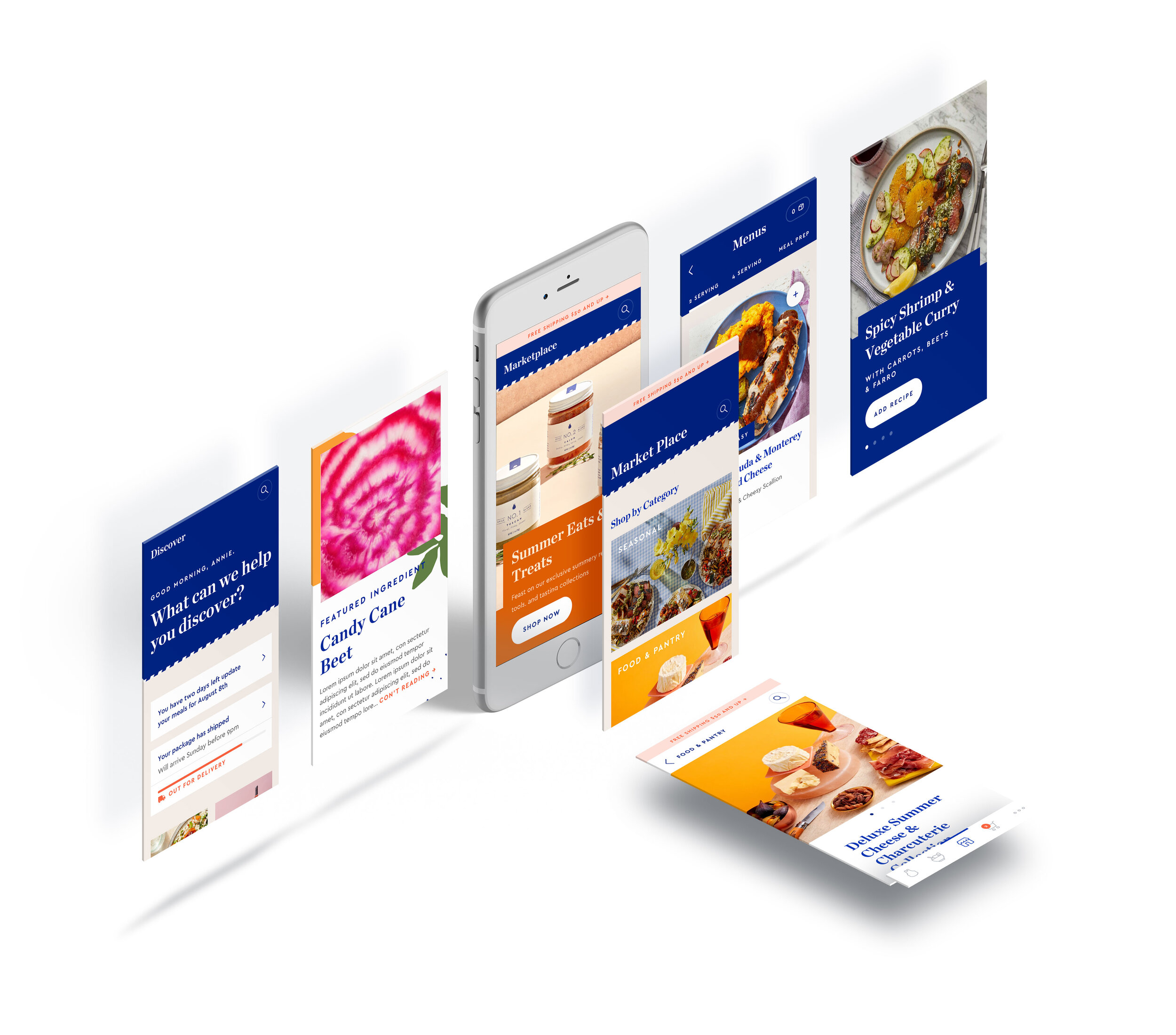
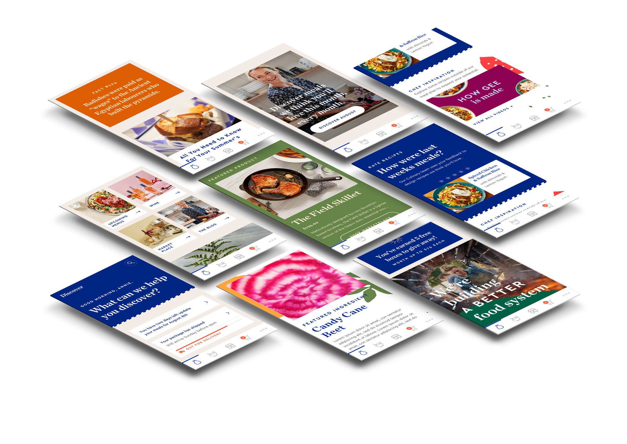
Discover was the new landing feed experience that was one part transaction, and one part discovery. The previous 'current' experience didn't have a place to engage customers in a thoughtful way. Blue Apron customers lacked easy access to the content the company was already making, including: campaigns, seasonal products, wine, marketplace products, blog content, 'how-to' content, and ingredient spotlights.
Content goals
The primary goal was to build a flexible experience for future innovation and customer LTV.
Engagement modules
Curated editorial, education, featured ingredients, and sourcing info.
Transaction modules
Product marketing and upcoming meal spotlight.
Utility modules
Notifications, feature reminders, and meal review module to strengthen meal selection algorithm.
Design system creation
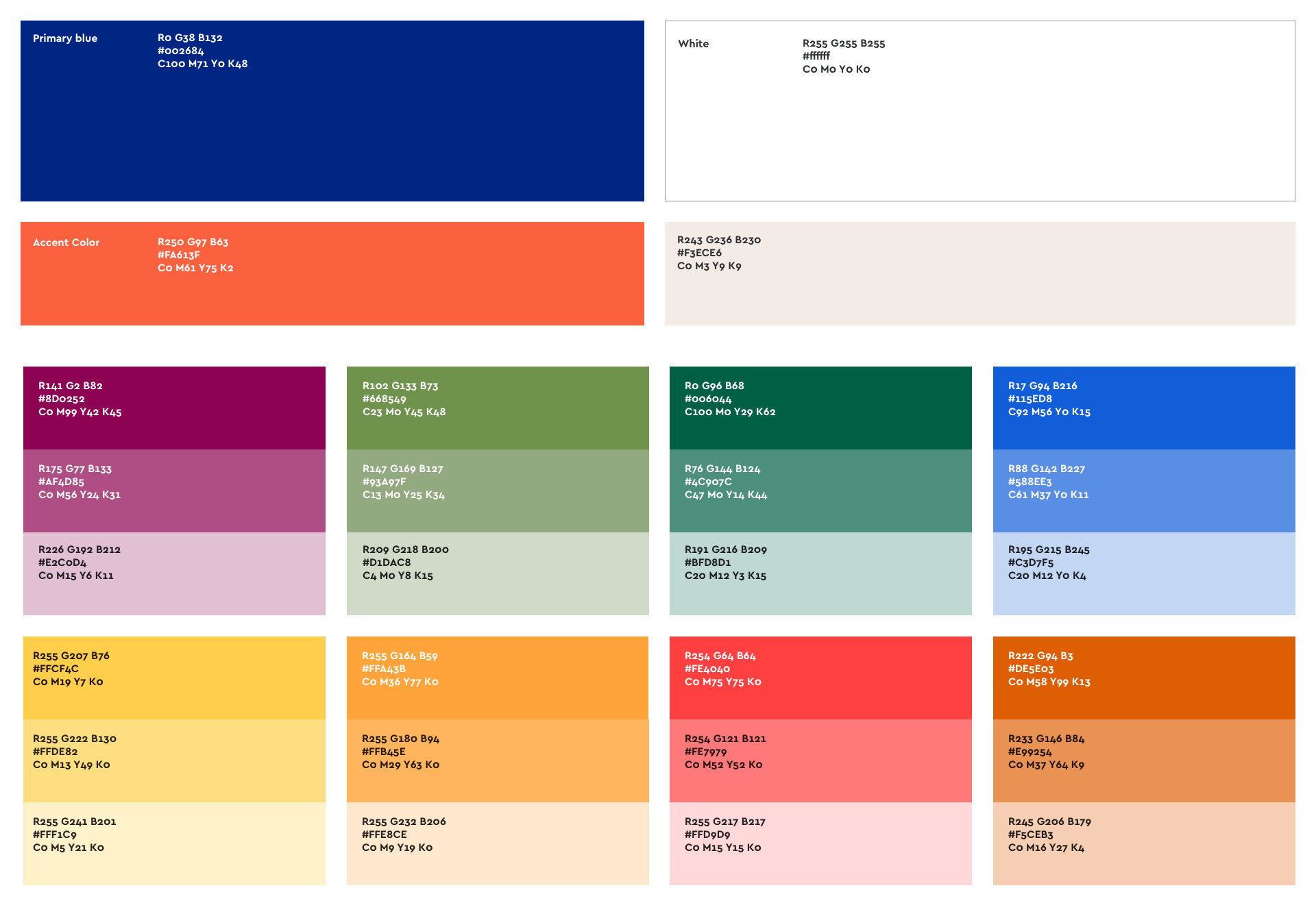
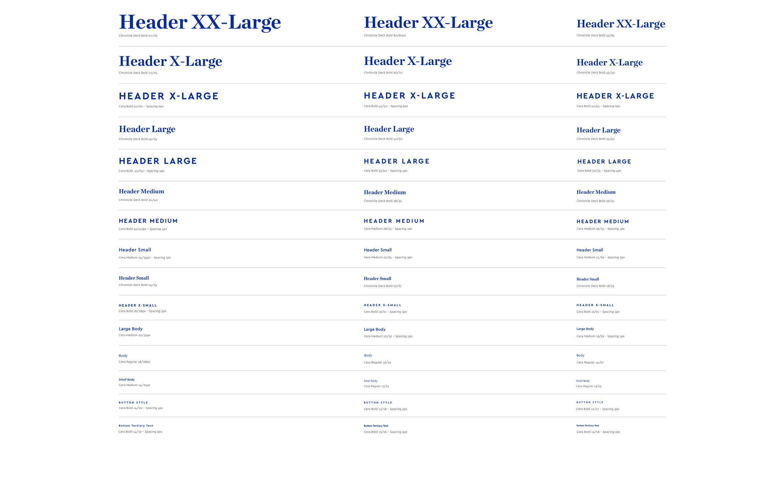
Working off a gestural rebrand created by Red Antler, the digital product design team led the rebrand design work through the modernity of the digital product. Digital product design motivated this initiative by setting typography styles, compositional layout, color palette rules, and iconography direction that were flexible and accessible by the broader design team.