Found
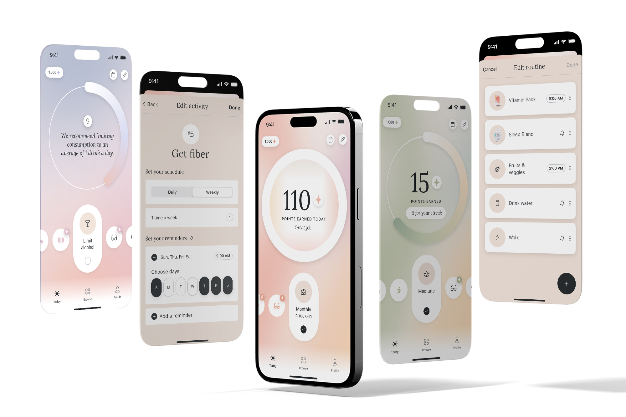
A first-month medication journey that provides guidance, clarity and personalization.
Description
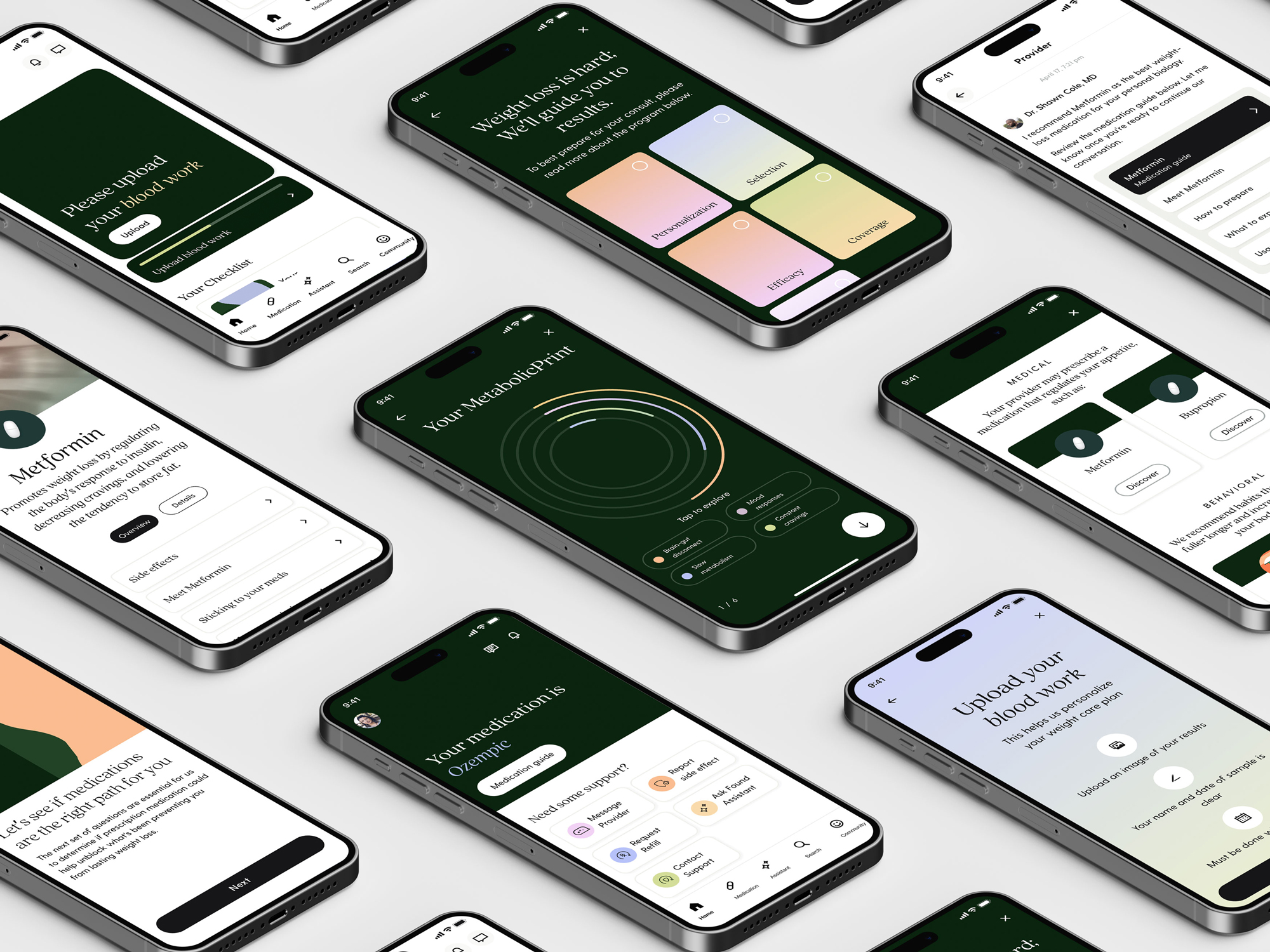
Found is an innovative weight-care platform and community dedicated to providing comprehensive support. Its enhanced medication journey assists users through what used to be a confusing and disconnected process, ensuring they embark on their health journey with the right tools for success. This initiative spans the complete experience, utilizing provider tools, a consumer app, lifecycle, and messaging to create a seamless end-to-end solution.
Problem themes
The team delved into extensive research and insights to identify several core issues to tackle within a span of two quarters. Although these themes don't encompass the entirety of our focus opportunities, below are the four problems we selected to enhance during the initial crucial stages at Found.
Expectations
It was not clear when users will hear from anyone on their Care team or what steps they should be taking. This lack of clarity created low NPS and long waiting periods.
Personalization
Members put in the time and gave us information, but little of that information influenced medical insights or various pathways on Found, reducing chances of hitting users goals.
Priming
Only a small percent of users are prescribed GLP-1's despite high interest in the medication. Found was not priming high-intent users for other options which caused dramatic churn.
Discontinuity
Providers, lifecycle and our digital experience were not connected in the way medication details were shared. This lack of clarity created variability in experience for members.
Product planning
We held a several-day onsite to research, ideate and align. In order to design a more clear, connected, and rewarding experience for our members we organized the member journey by chapters to focus various needs and expectations. We began with three initial chapters across the first month of the user journey.
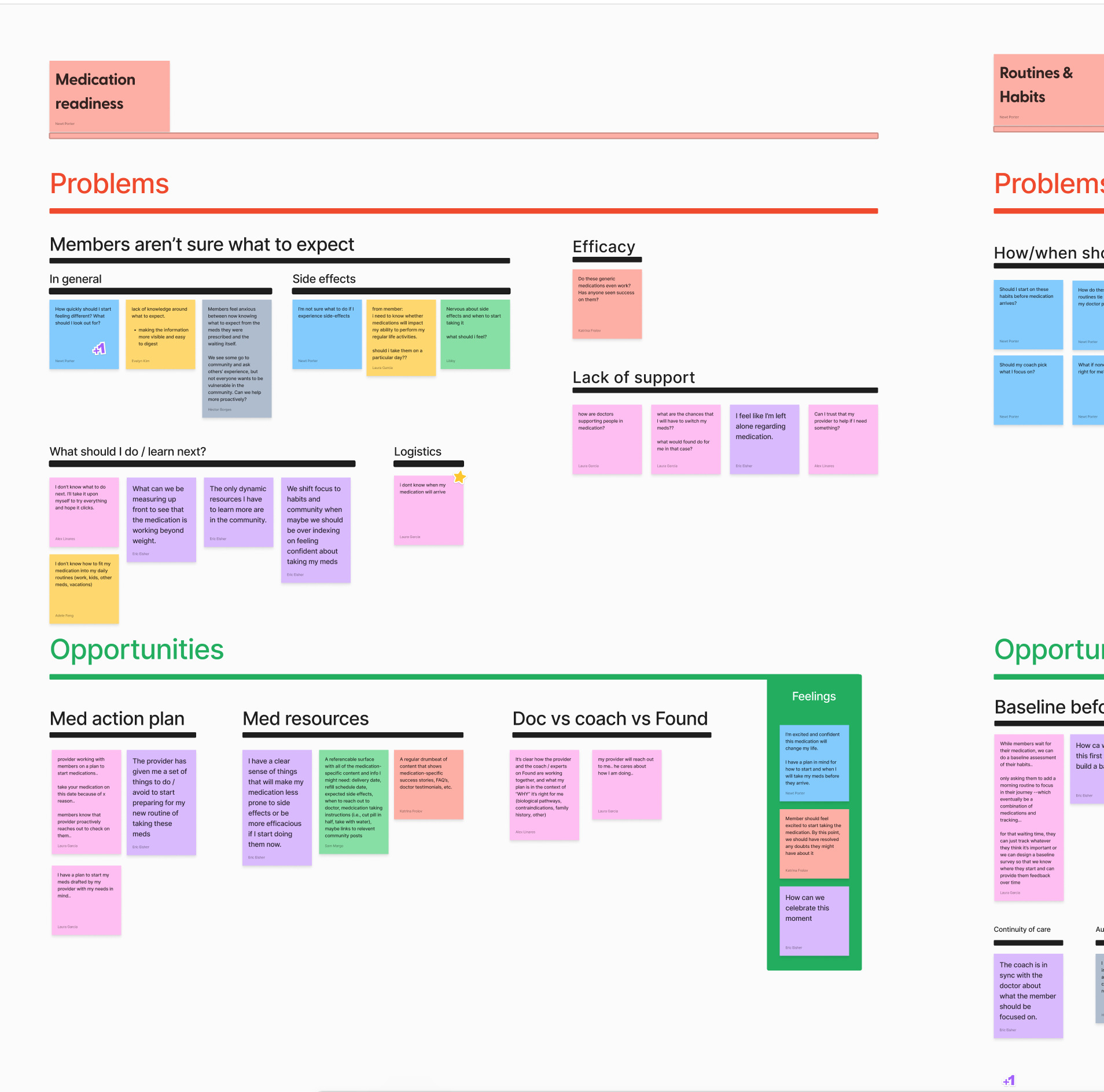
Expectations
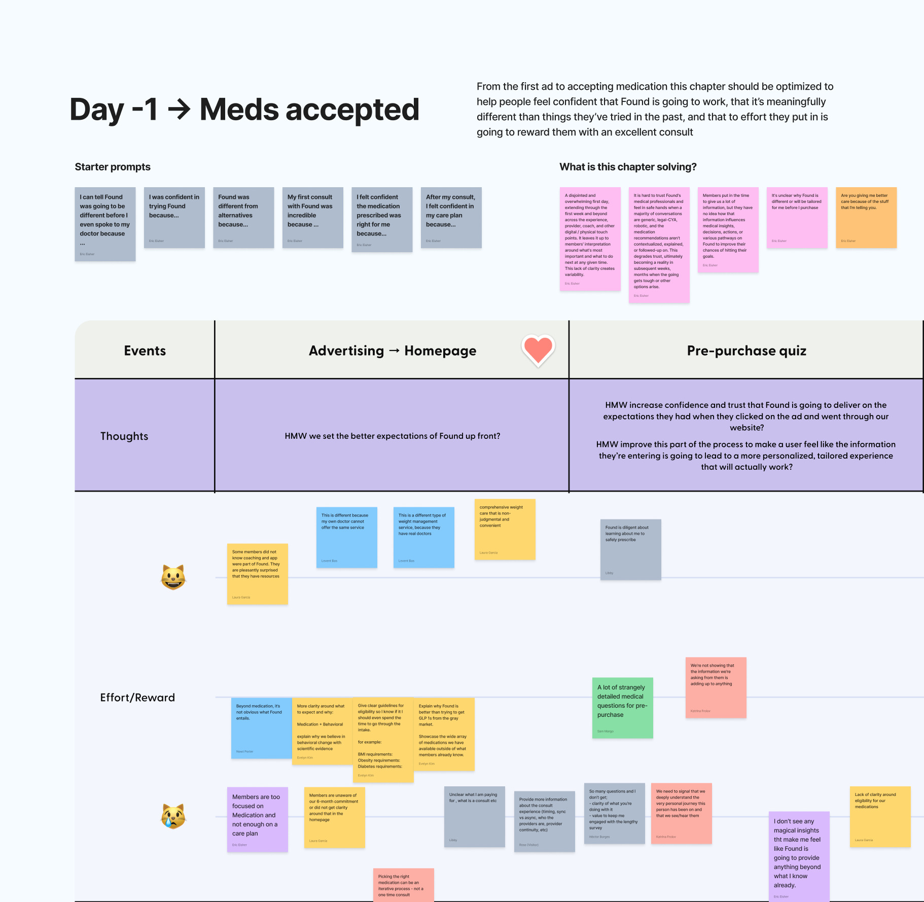
Users experienced a disjointed and overwhelming first day, extending through the first week, and beyond, across the provider, coach, and digital touch points. This left it up to members' interpretation around what's most important and what to do next at any given time. This lack of clarity caused volatile NPS and a dramatic W1 drop in retention.
Concept exploration
We examined multiple distinct solutions for the onboarding flows, encompassing aspects such as intake processes and gathering other essential information.
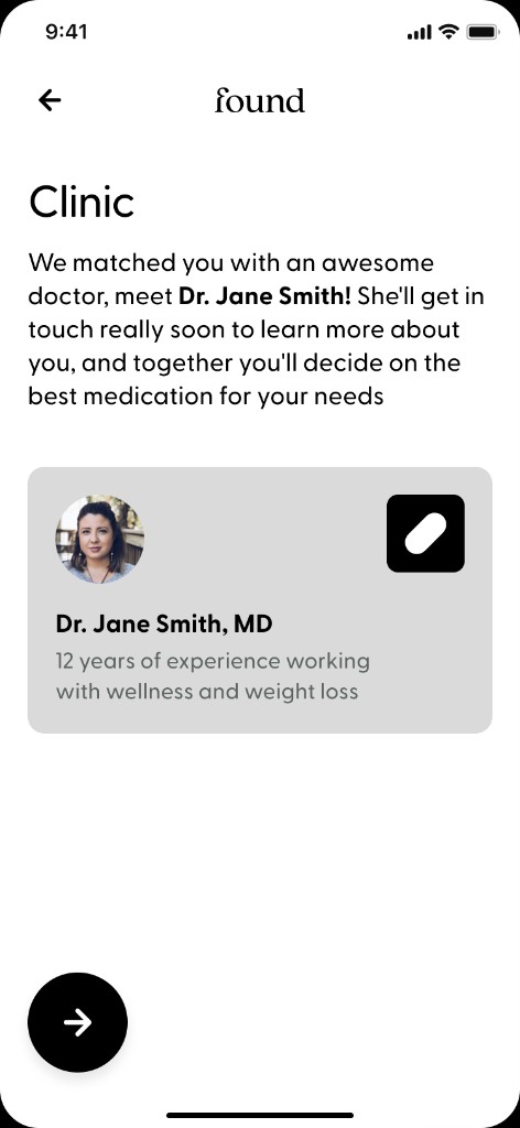
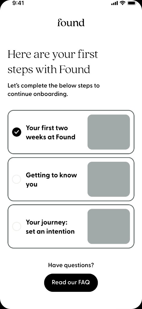
Highly guided
Explored an isolated onboarding that took the user step by step in a focused view.
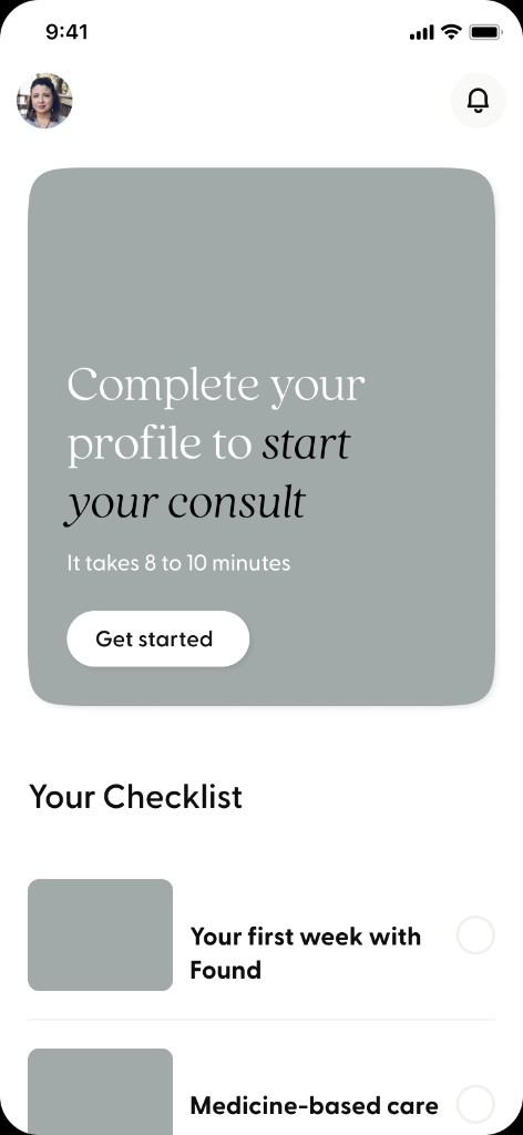
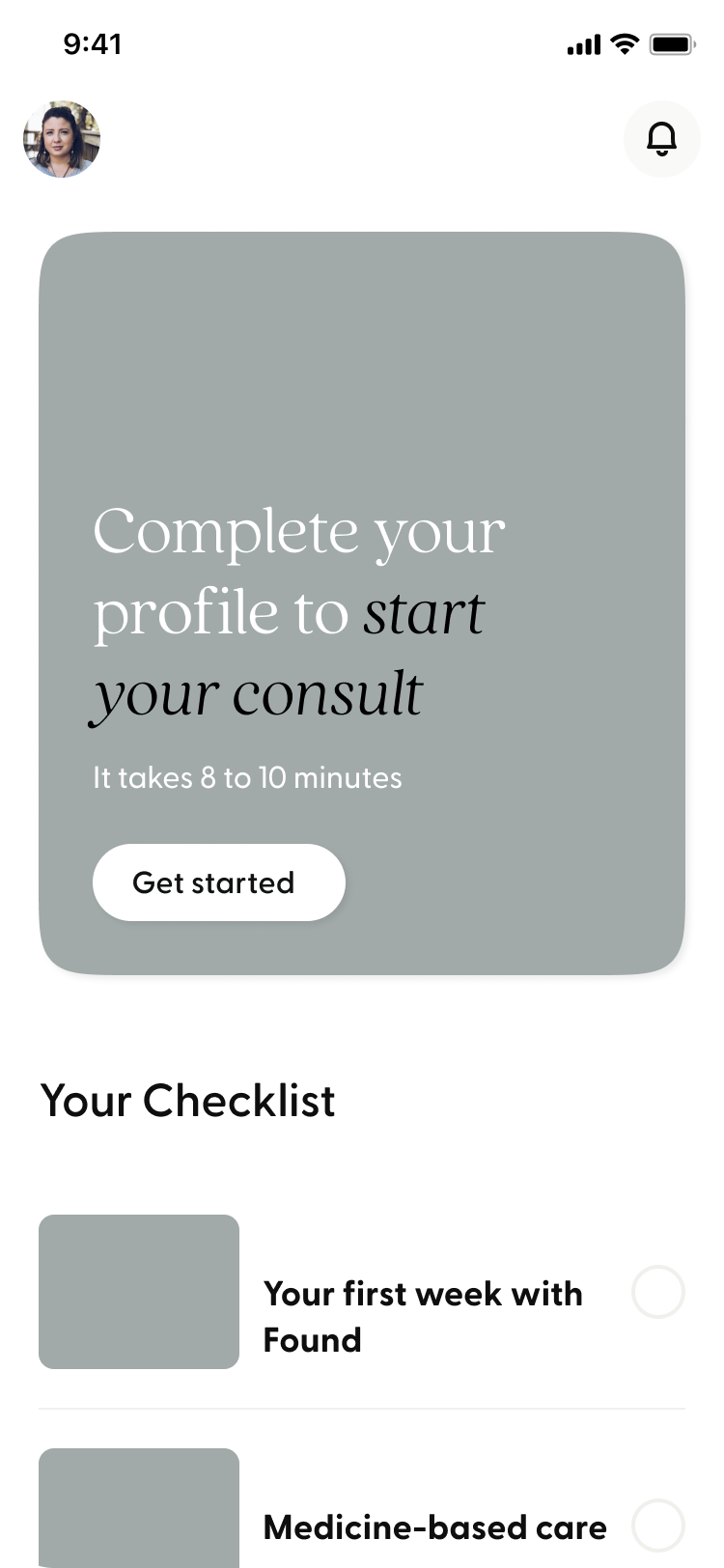
Platform concept
Leveraged the existing checklist for expectation setting but introduced a new hero card for hierarchy.
Locked experience
Explored how we might add a checklist for expectation setting before accessing the app.
.png)
Build one, solve many
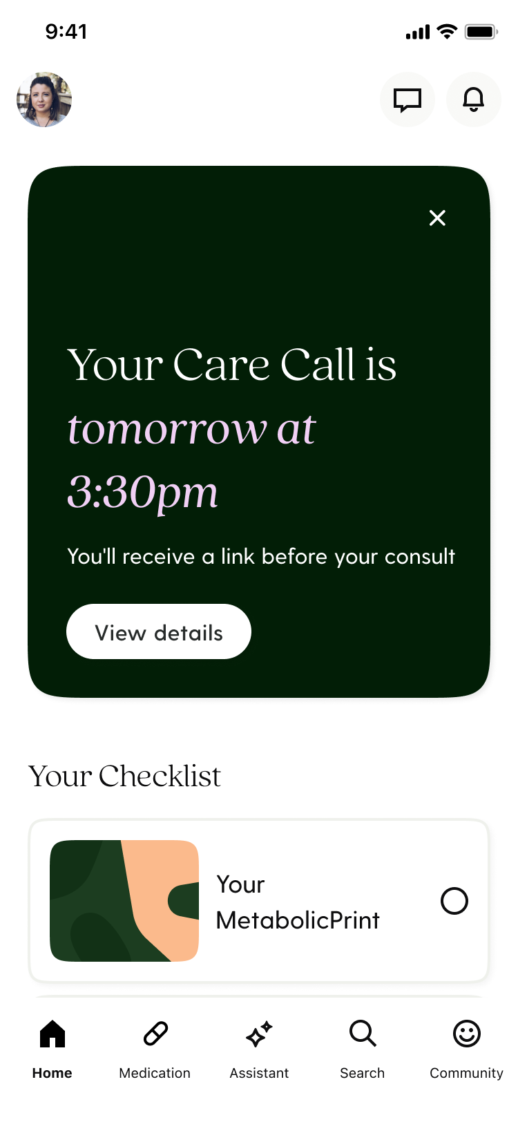
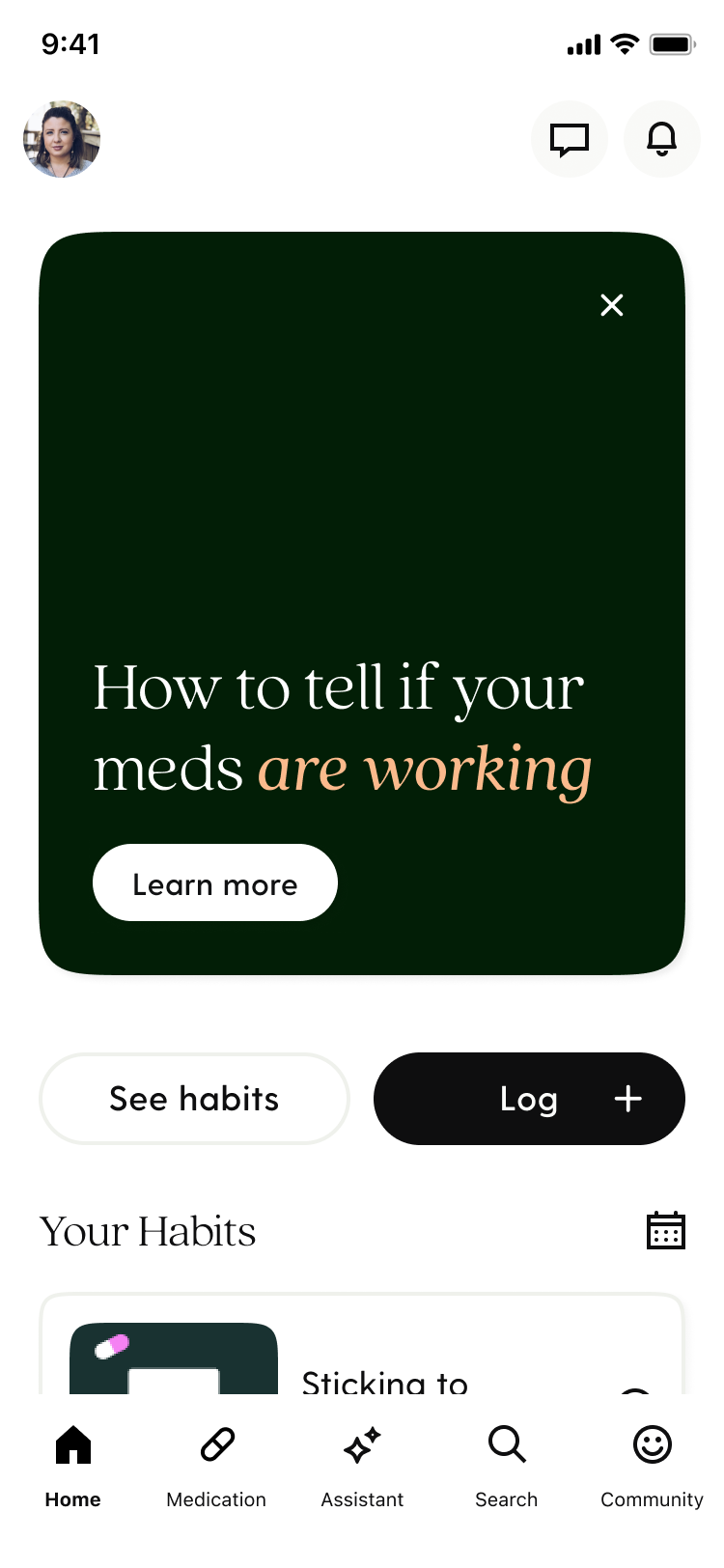
We constructed a state machine designed to prompt users with the most crucial actions, directing them to various sections of the app based on their current needs. This approach was chosen for its adaptability and its suitability for implementation across the entirety of the user journey.
Home Intake
Scheduling
Waiting for meds
Intake incomplete
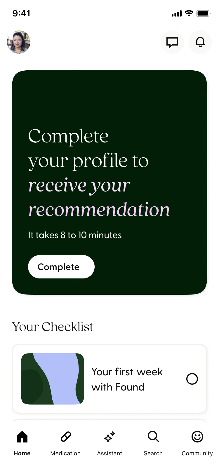
Through research, we conducted an eight-week diary study to understand the needs and expectations of members at specific intervals.
Confidence
New members want to understand the Found program holistically and want to see others who've been successful so they can feel confident about their weight loss journey.
Starting Medication
New members starting medications want to understand if and when their medication is working so they can set proper expectations and mitigate potential side effects.
Adherence
New members want to understand how the refill process works and want reminders so they can follow Found's clinical guidance and reach their weight loss goals.
GLP-1's
New members interested in GLP-1s want to understand the lengthy process so they can complete the required tasks and have accurate expectations around the process.
Resources
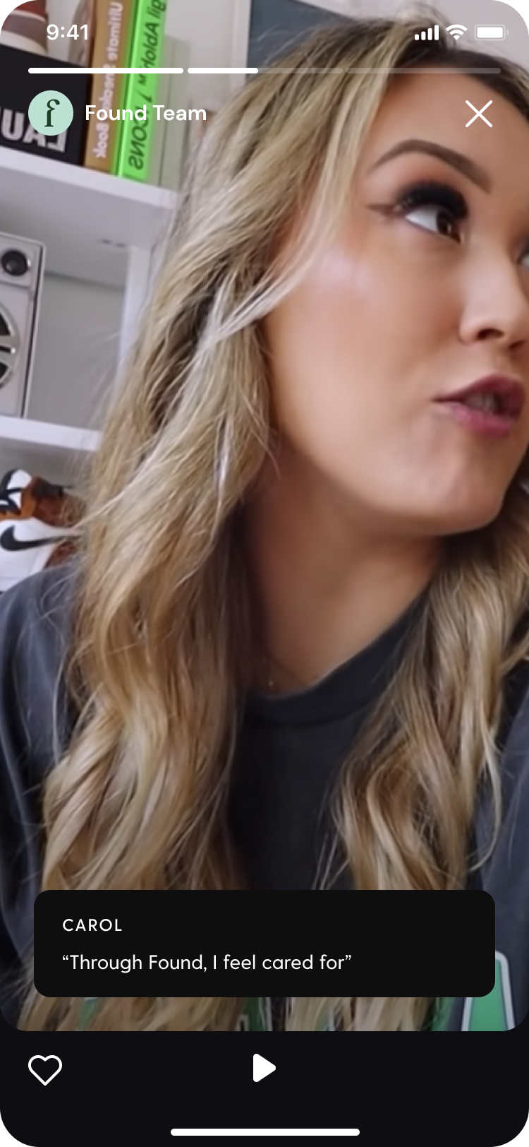
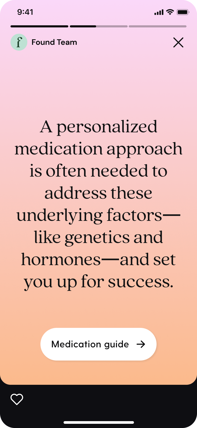
The hero and checklist routed members to resources that best addressed their needs along the journey.
Videos
Ex: Member tips on side effects during week 3 of medication
Story-format
Ex: Digestible format 'Medication for Weight loss' during week 1
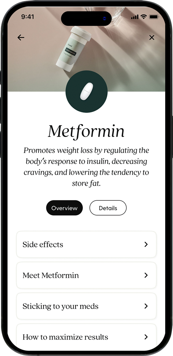
Medication Guide
Ex: A repeatedly used resource that provides detailed information
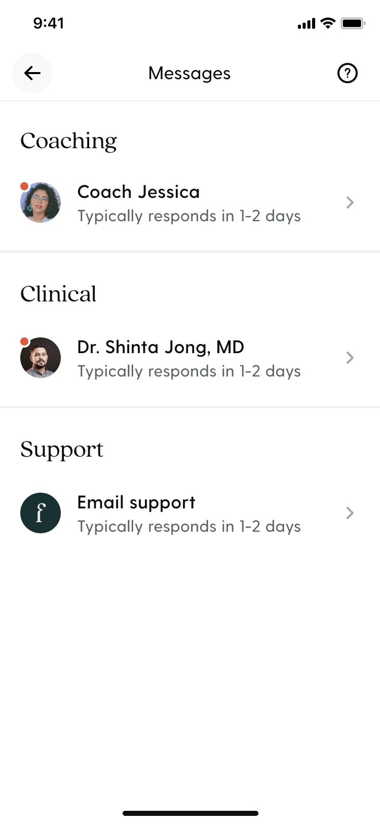
Message Center
Ex: Easy access for preparing or scheduling a provider consult
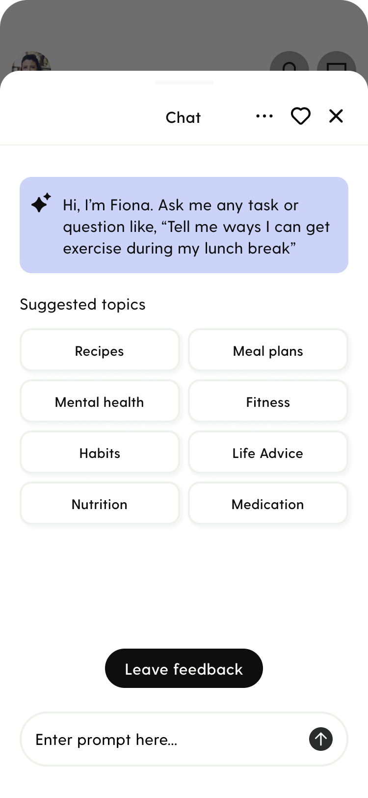
AI Assistant
Ex: Prompts and routing to guide users on all things wellness

Journey designs
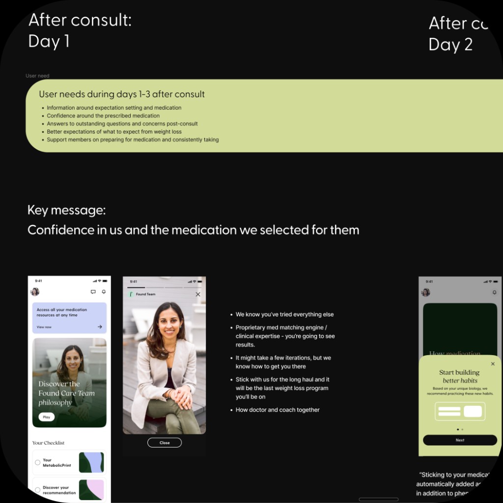
Confidence
Introducing the Found program holistically at the initial sign-in helped introduce confidence and clarity.
GLP-1
A progress bar and step guide that explained the process for medication procurement set expectations.
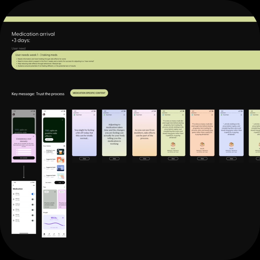
Starting Medication
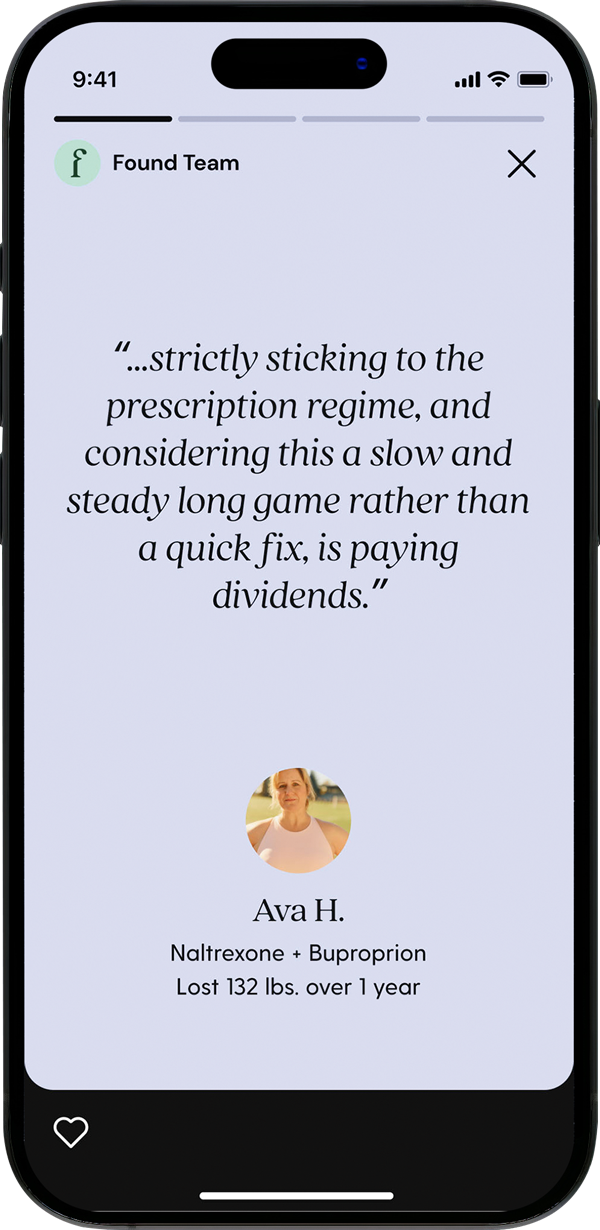
Churn prevention tests found that testimonials on success and side effects improved retention.
Adherence
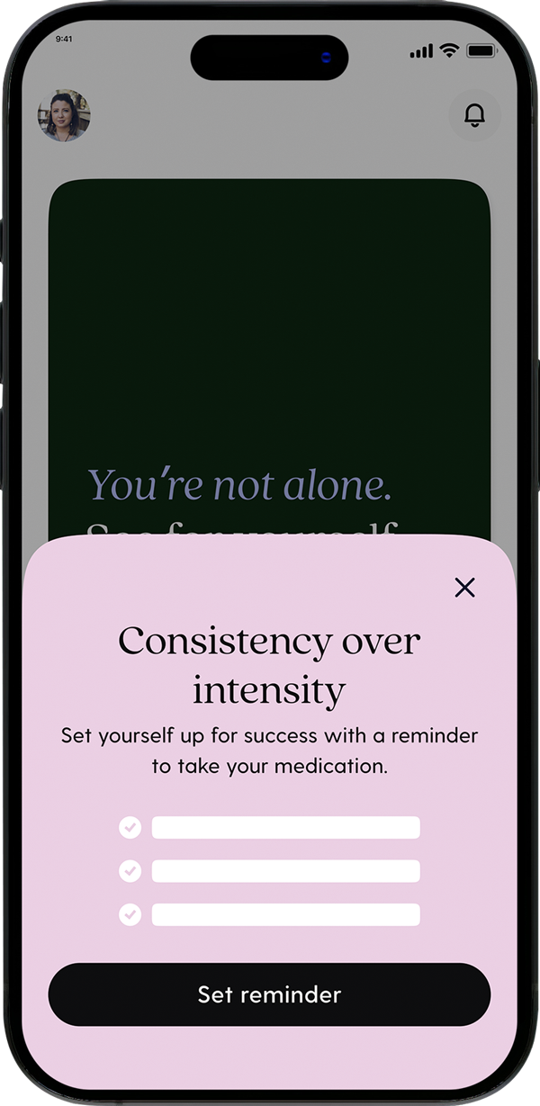
Walking users through the refill process and prompting users to set up reminders were new tactics.
Personalization
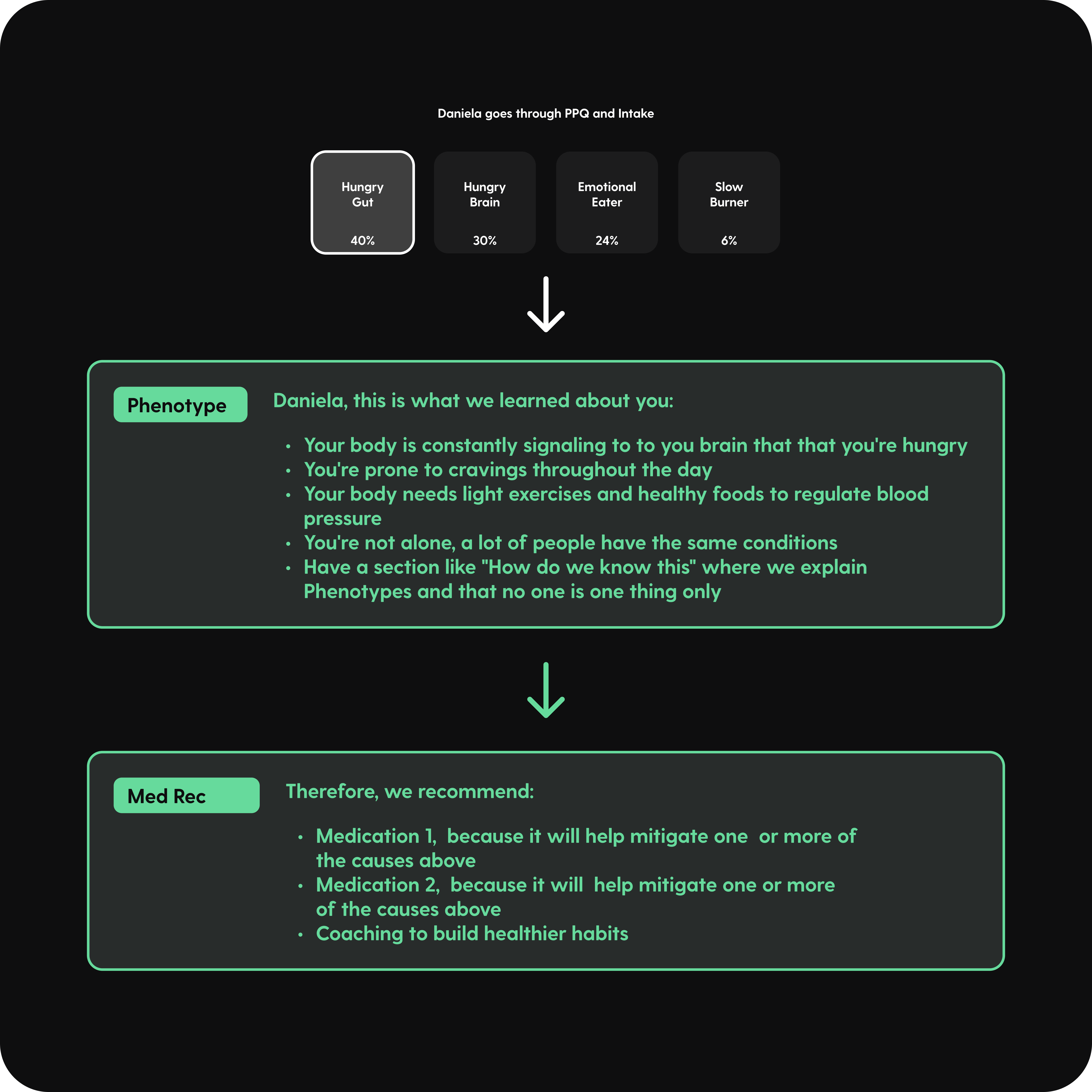
Users felt that Found was not attentive to their individual needs, lacking a sense of uniqueness in their experience. In response, Found's clinical experts aimed to introduce a distinctive treatment methodology. This approach involved delving into the underlying biological factors contributing to a patient's obesity, thereby devising a personalized treatment plan. This biological approach utilizes a classification system termed 'phenotypes' to address both medical and behavioral modifications.
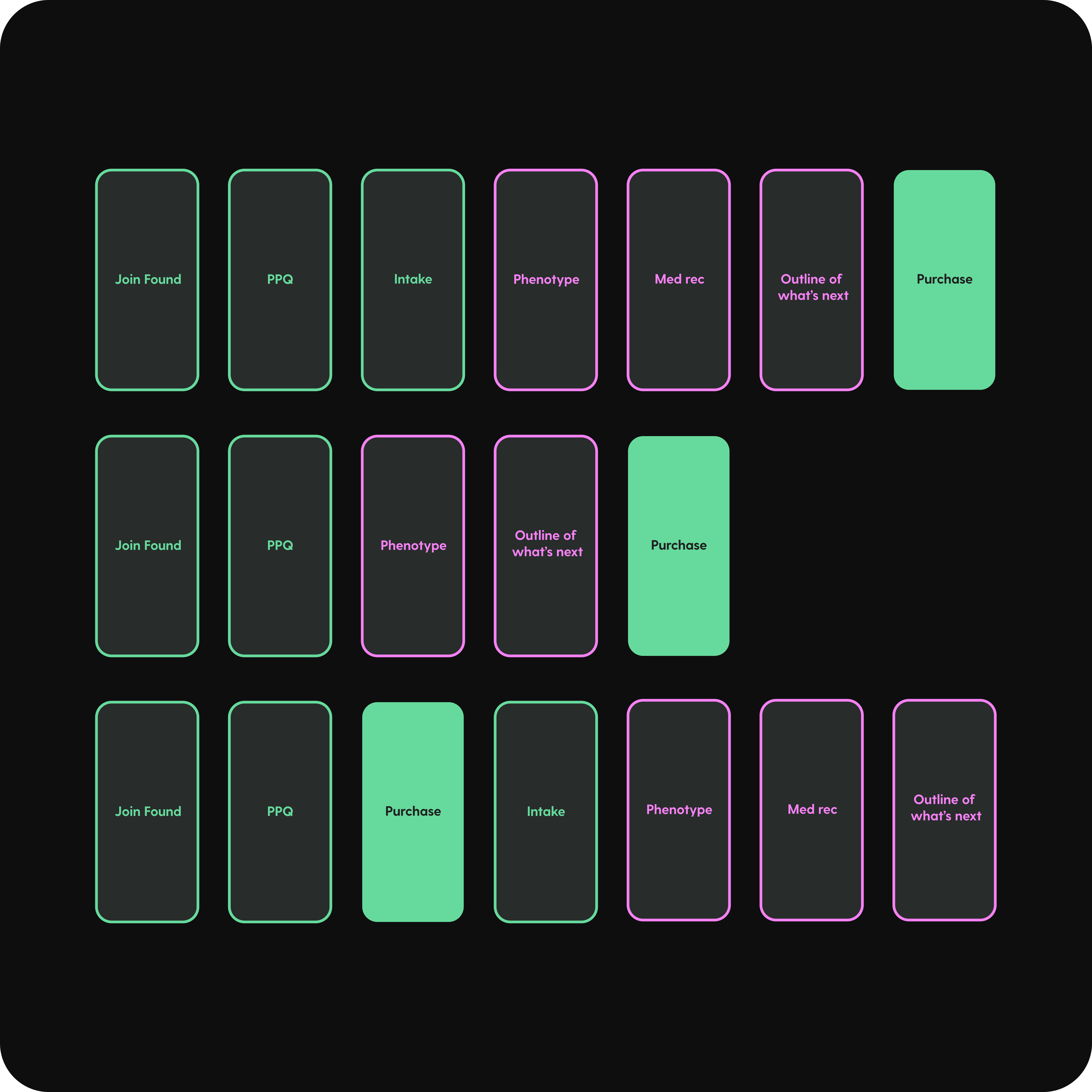
Pre-purchase quiz and intake
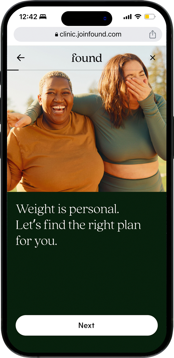
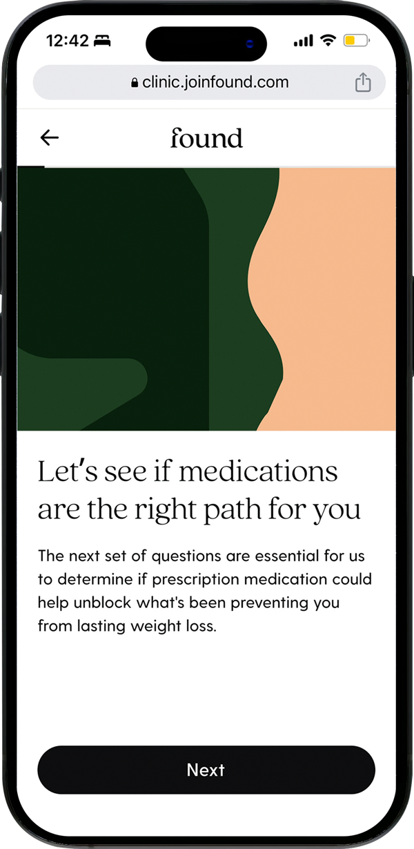
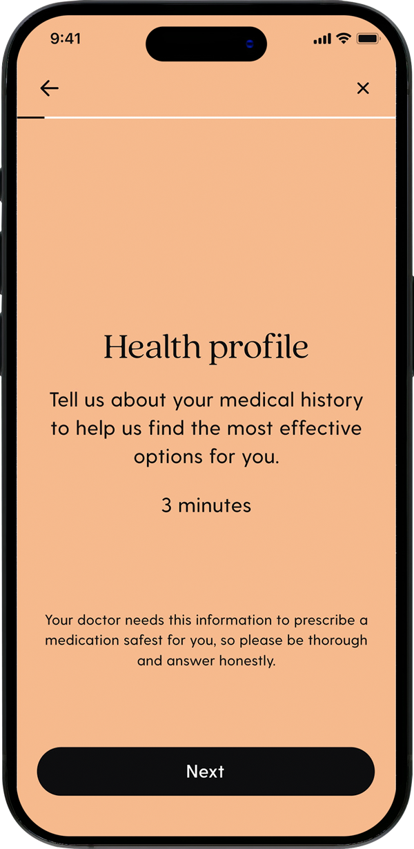
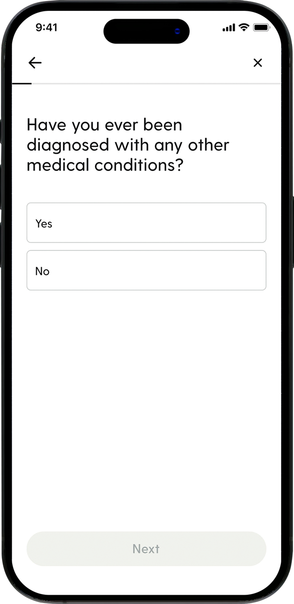
By recognizing and addressing the different obesity phenotypes, we tailored treatments to the specific biological needs of each individual.
Concept exploration
We explored several divergent solutions for the phenotype experience within the context of onboarding. We determined the best placement for the experience was post intake.
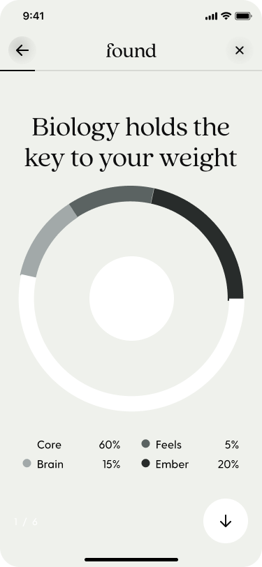
Highly guided
An isolated phenotype flow that took the user step by step in a focused view.
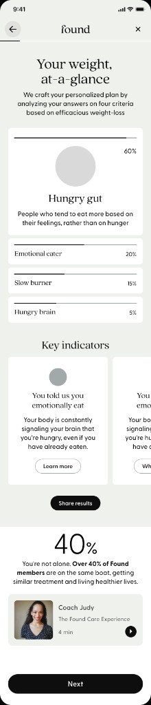
Clustered
Separated insights and recommendation to two screens.
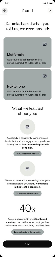
One screen
A direction that discarded data visualization and highlighted the insights in one screen.
Qualitative testing confirmed that a highly guided experience helped users absorb information and instill confidence.

Phenotype details
Onboarding
The flow was placed after intake to reward users after the questionnaires and made evergreen accessible.
Holistic breakdown
The initial landing show a users percent breakdown across all phenotypes with the ability to dive deeper.
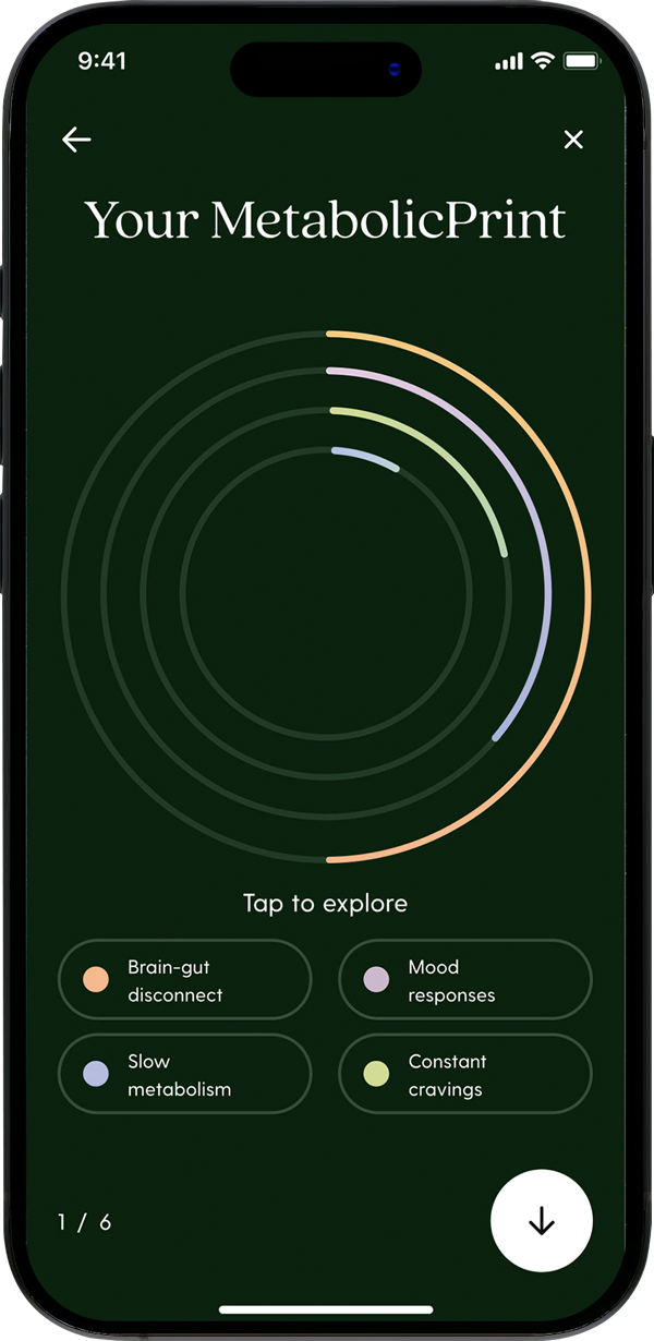
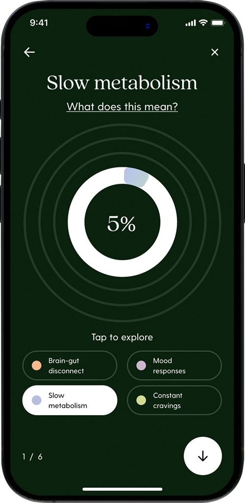
Percent breakdown
The percent breakdown of each phenotype is shown with the ability to learn more about each category.
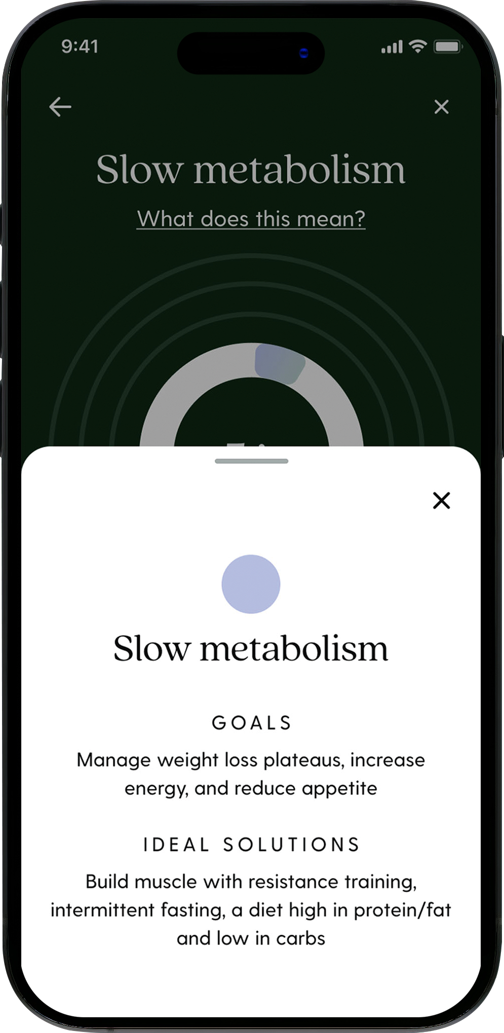
Description
Providing information on the phenotypes and how to address each one is valuable in personalization.
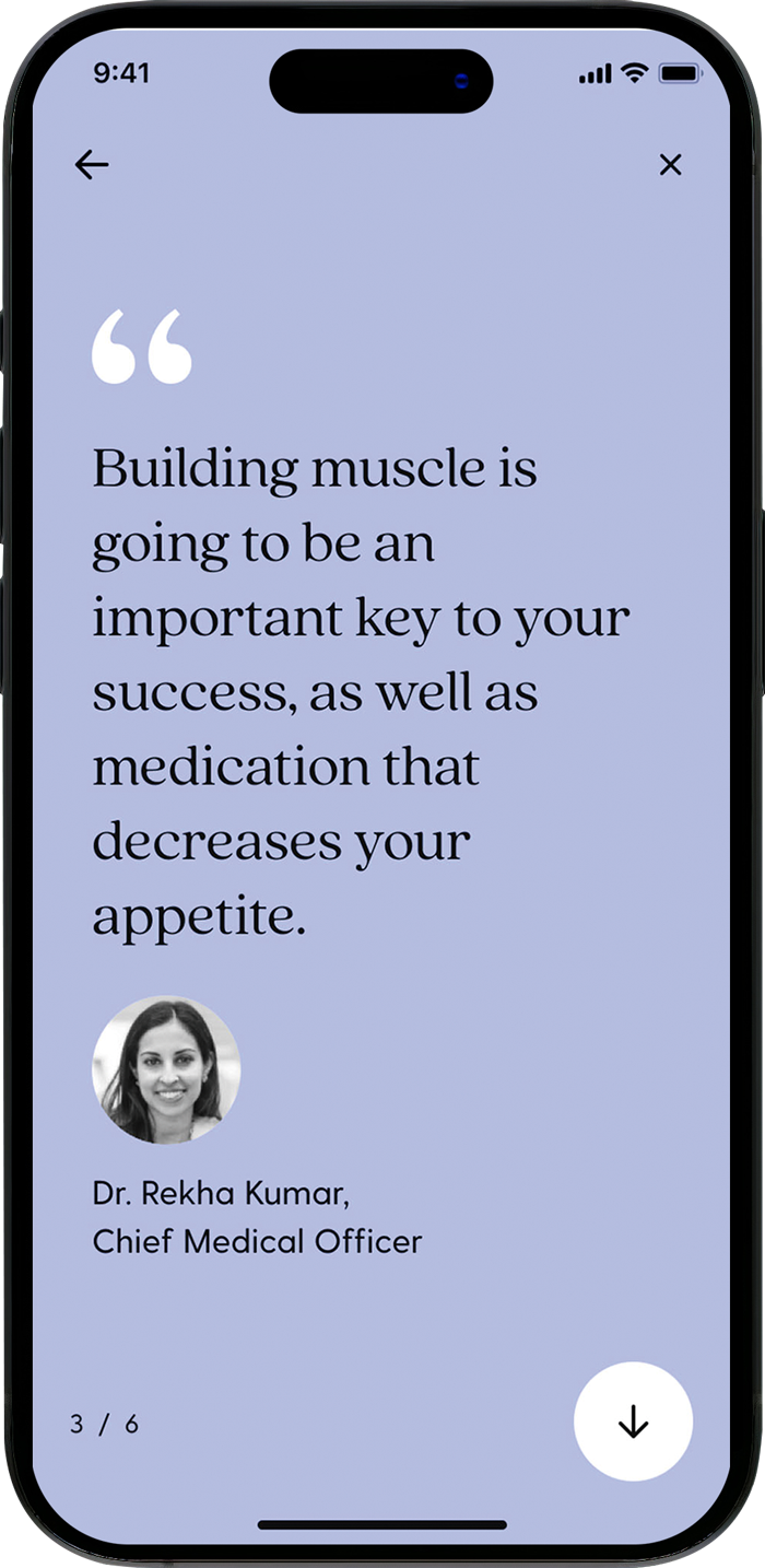
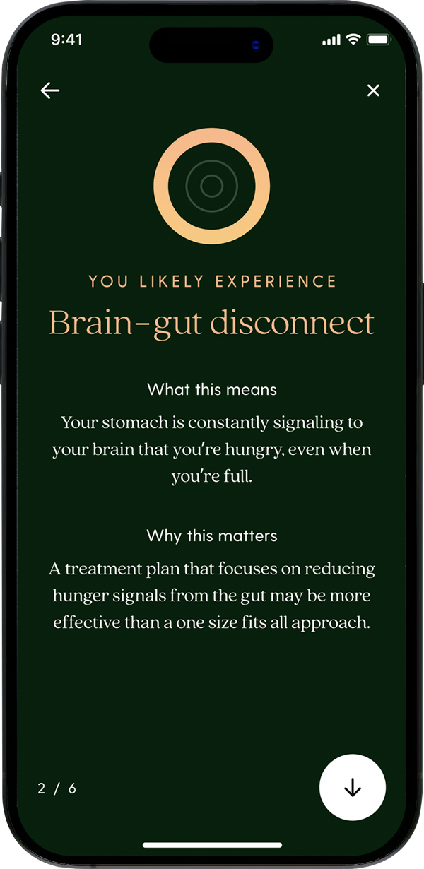
Scientific expertise
The voice of Found's Chief Medical Officer provided personalized messaging.
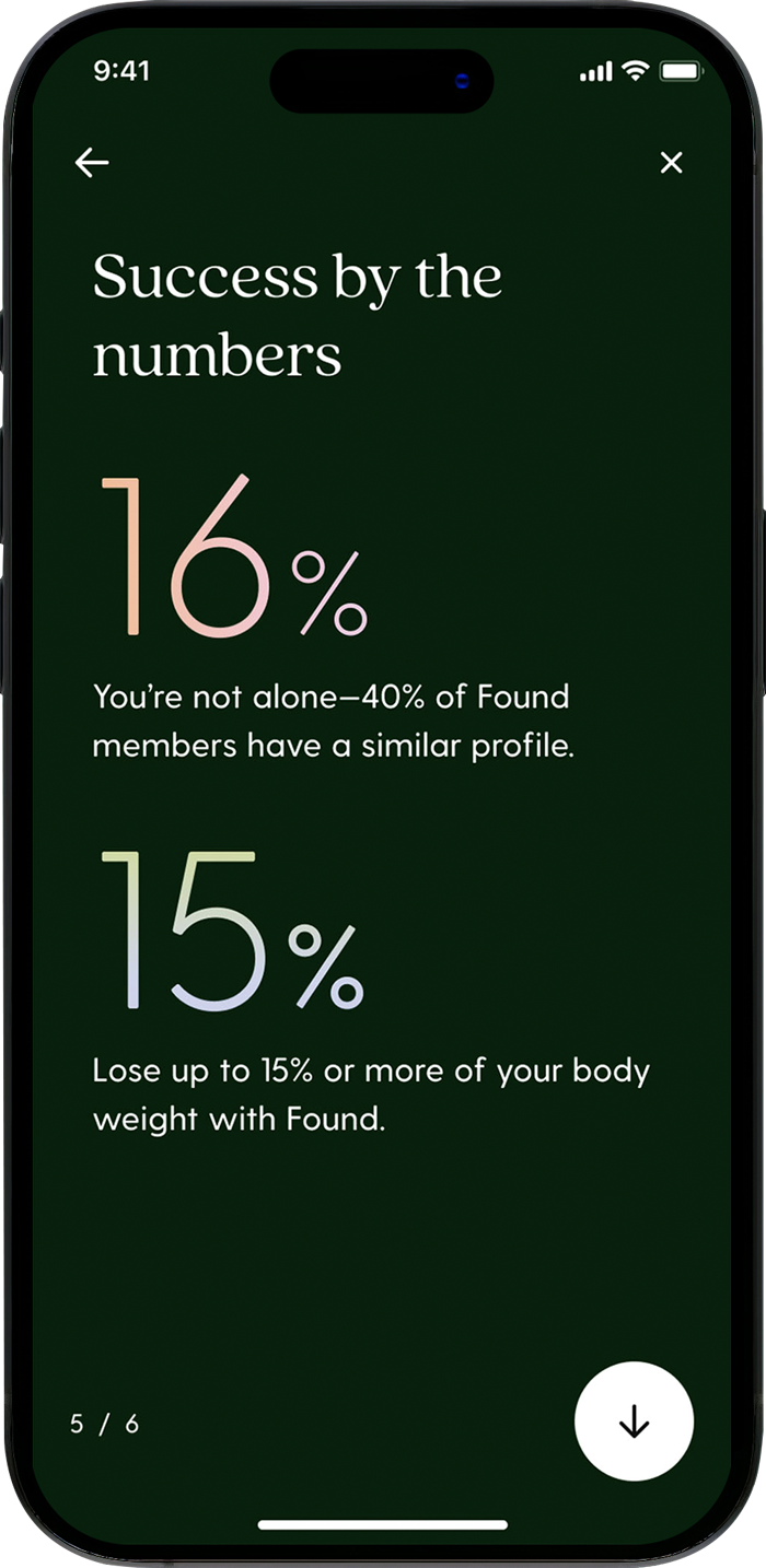
Success metrics
Reiterating success metrics helped decrease churn and increase confidence.
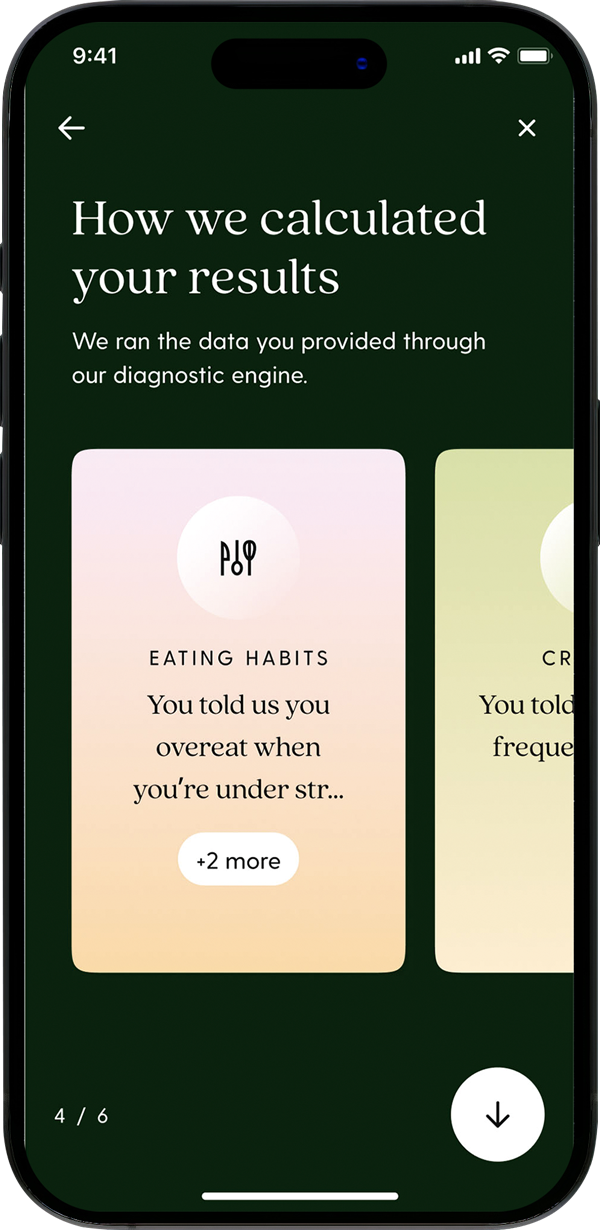
Feedback
Key points that determined results provided an opportunity to show Found was listening.
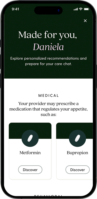
Recommendation
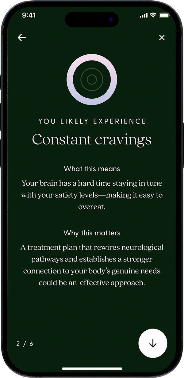
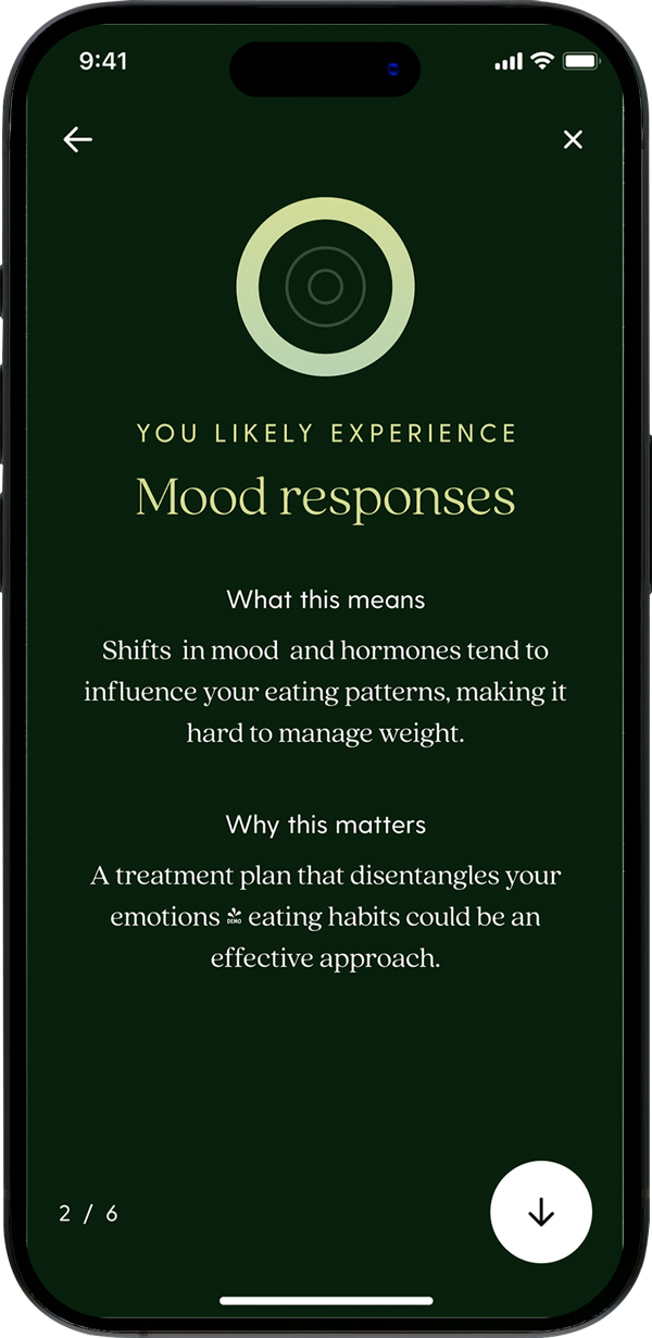
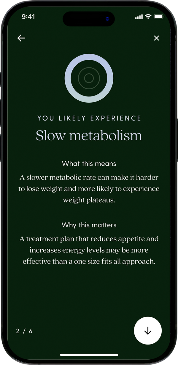
Based on the phenotype, three initial habits and potential medication matches are shared.
Strategic business decision
We worked with providers to establish new service guidelines and coaches on how to adjust habit protocols with the introduction of phenotypes. After onboarding, a user can access the flow again in the medication home.
Brain gut
Constant cravings
Mood response
Slow metabolism
Priming
Media coverage on medications like Ozempic made GLP-1's highly sought after, however, only 4% of users are prescribed a GLP-1. This low percentage was primarily due to shortages in supply, high costs, and lack of insurance coverage. This discrepancy between user expectations and the reality resulted in high churn rates. Our objective was to better prepare users for generic medications. To start, we identified the following key problems:
Tunnel-vision
Many members aren't aware that generics are equally efficacious, less expensive, and readily available.
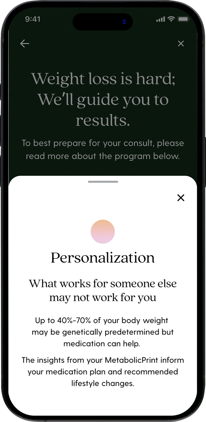
Personalization
Members might not be aware that medication selection is tailored to their biology and a GLP-1 might not be the best for them.
Increased chances
Many members are unaware that they can increase their chance of getting a GLP-1 by starting on something different.
Added cost
Members might not be aware that the cost of GLP-1's are not included in the Found membership and are very expensive.
82%
Users with high interest in GLP-1
4%
Users who get prescribed a GLP-1
40%
Churn before prescription
Product planning
We began by getting a full view of how we were presenting GLP-1's and where we were priming users for non-glp-1 medications across the journey. With this information, we saw a critical opportunity to change how we prime users across marketing, growth and retention, which began a new initiative across the company.
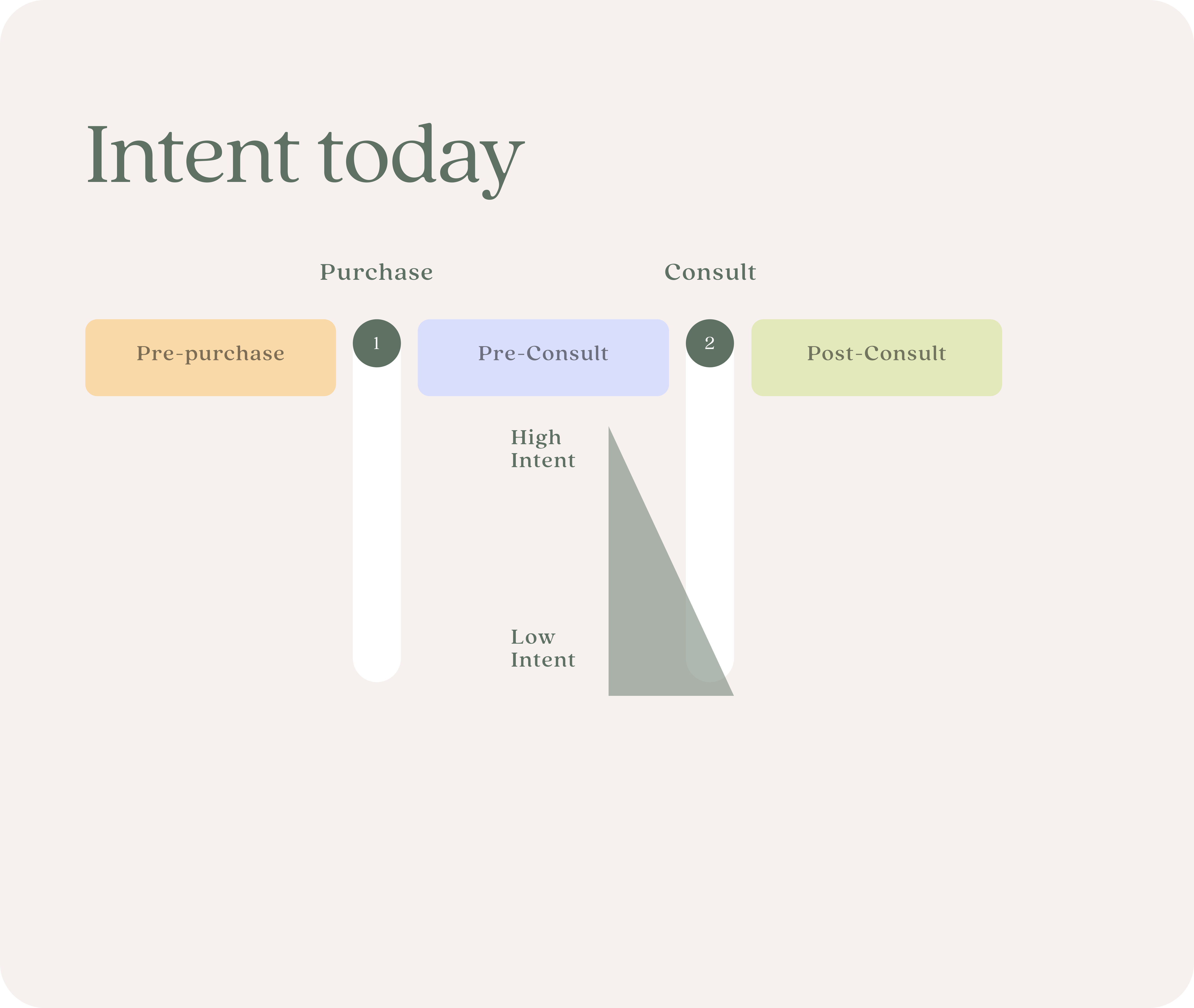
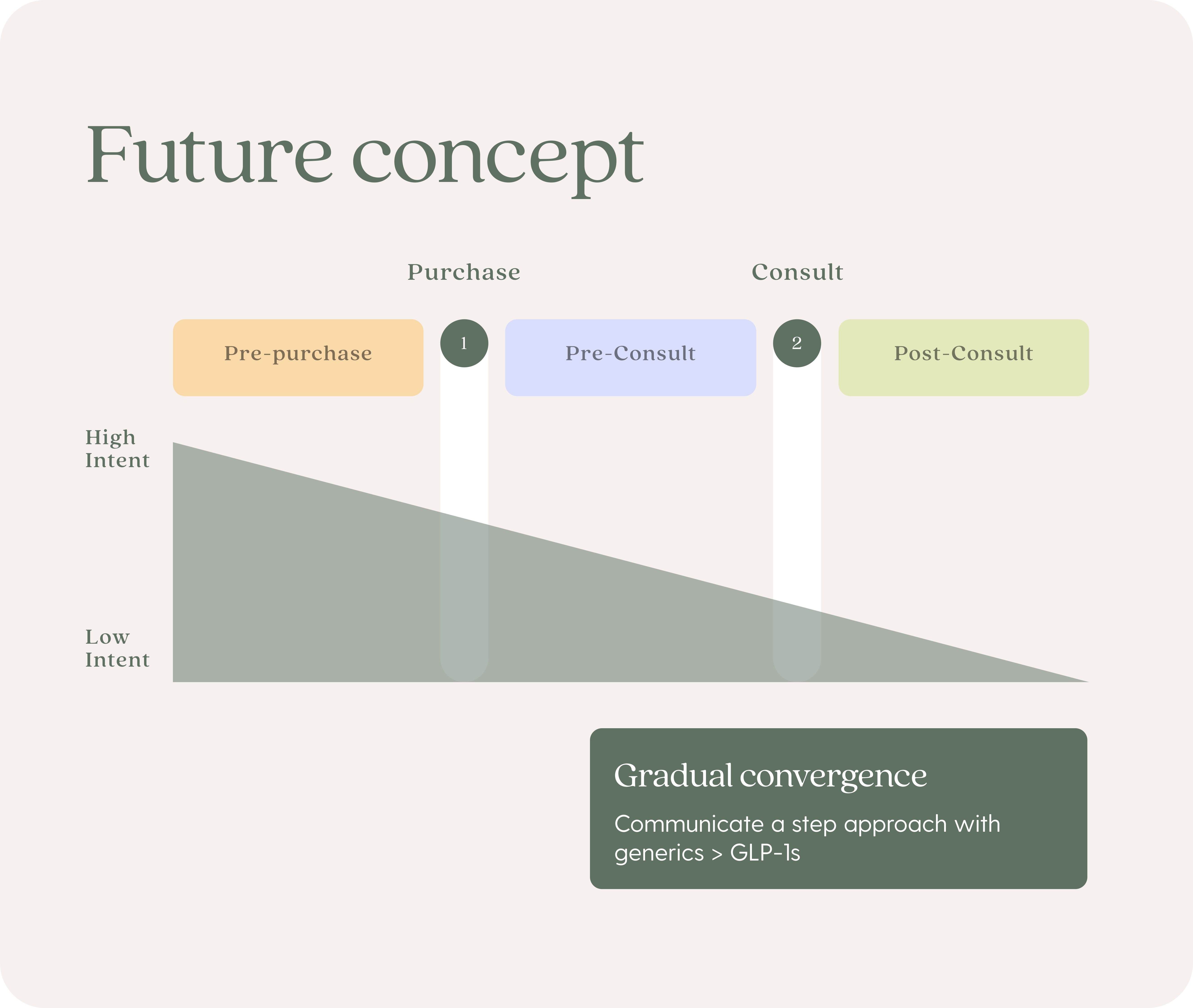
Our initial design efforts focused at the most critical moment; before and immediately after the provider consult.
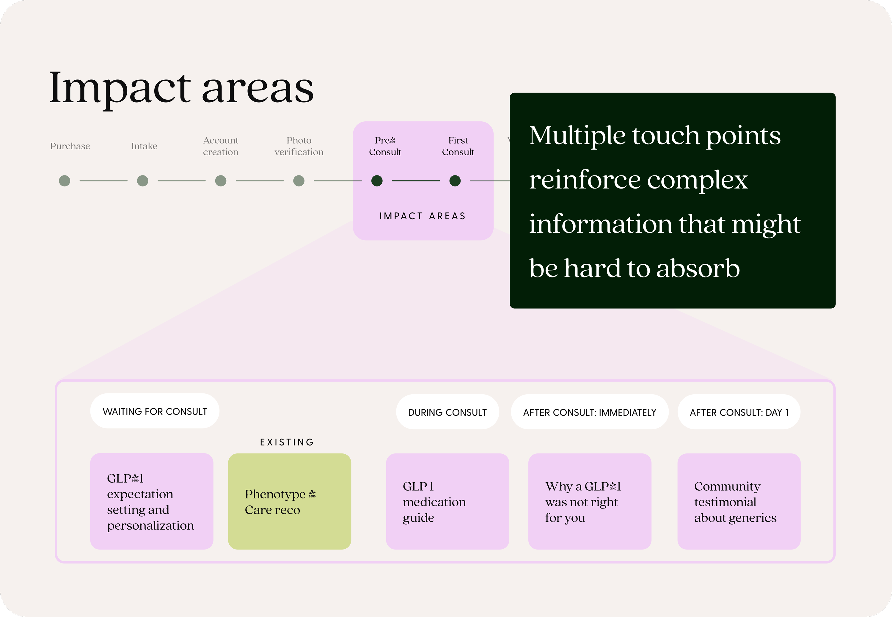
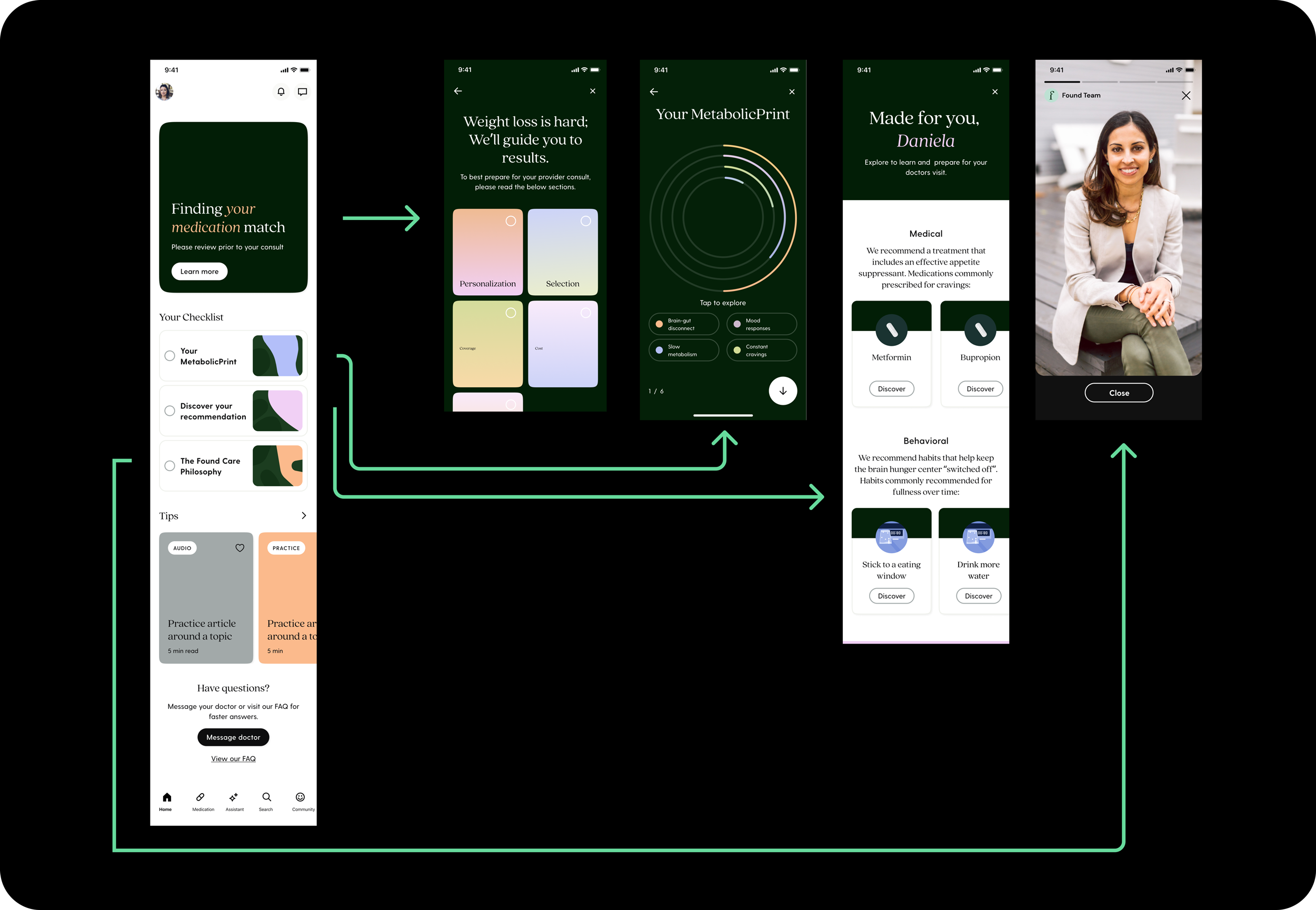
We hypothesized that a focus on personalization and clearly outlining the comparisons between generics and GLP-1's will increase the likelihood a user will be more open to generics.
Concept exploration
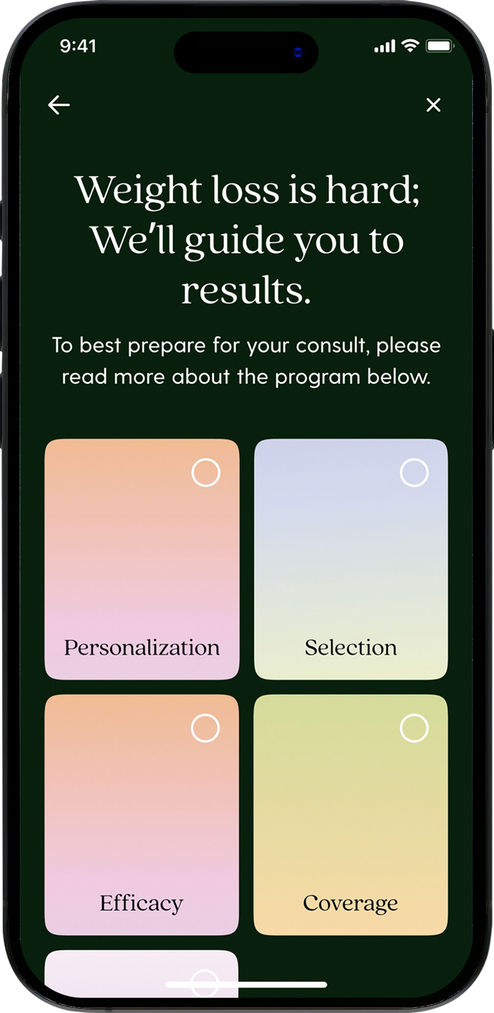
Our goal was to facilitate users realization that a GLP-1 might not be the best for them and to decrease the burden on providers to share all medication education.
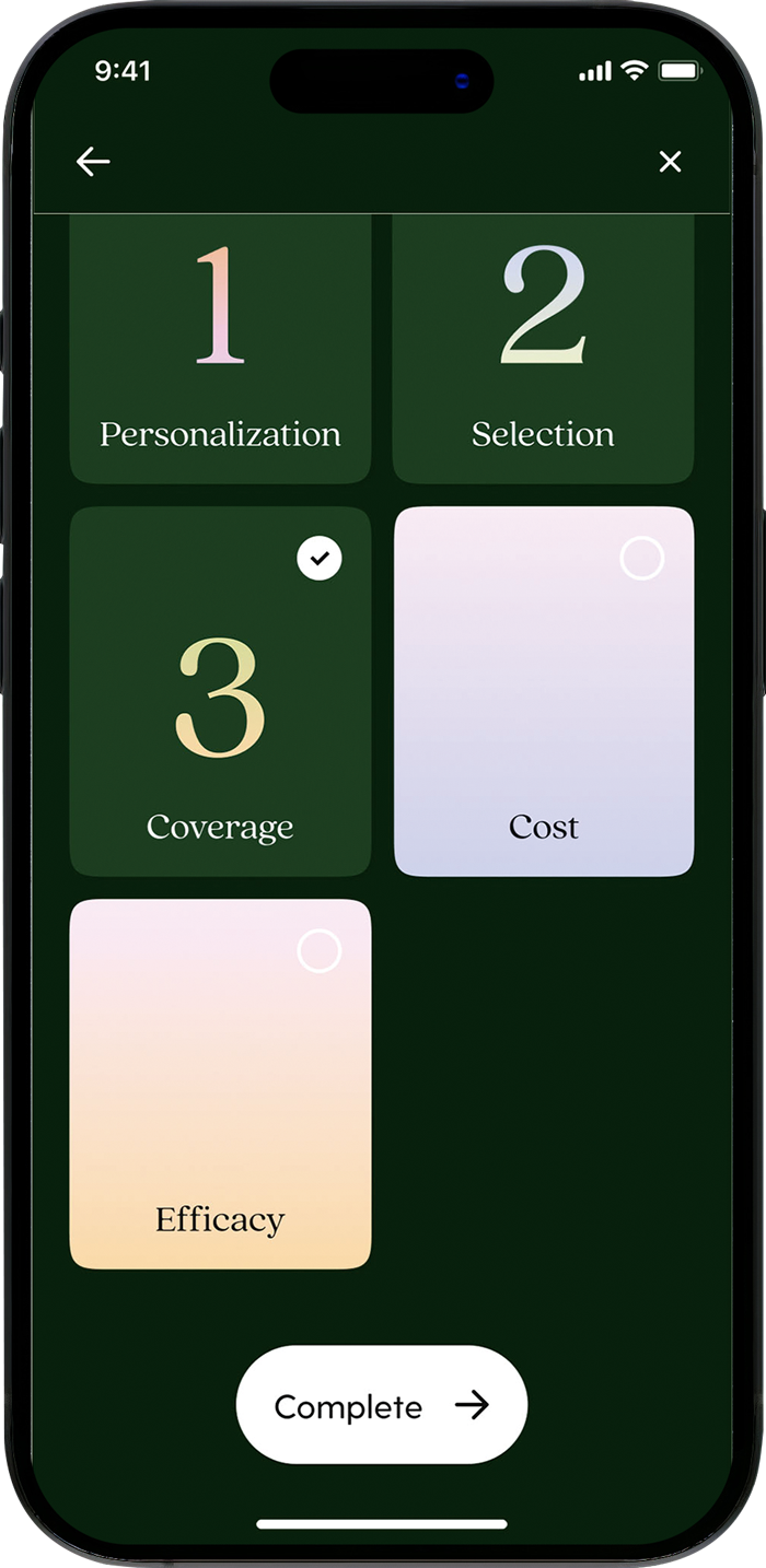
Step by step
Takes the user through a series of screens and uses graphics as a focal point.
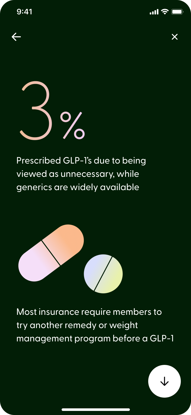
Clustered
An option that separated personalization and consult insights into two screens.
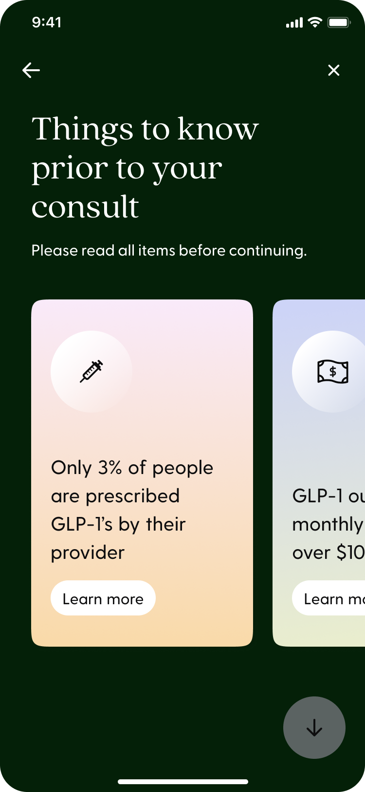
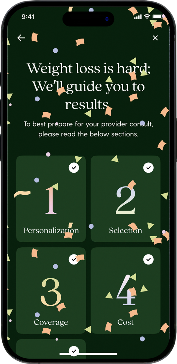
One screen
Leaning into gameification, this tiled approach presents the information.
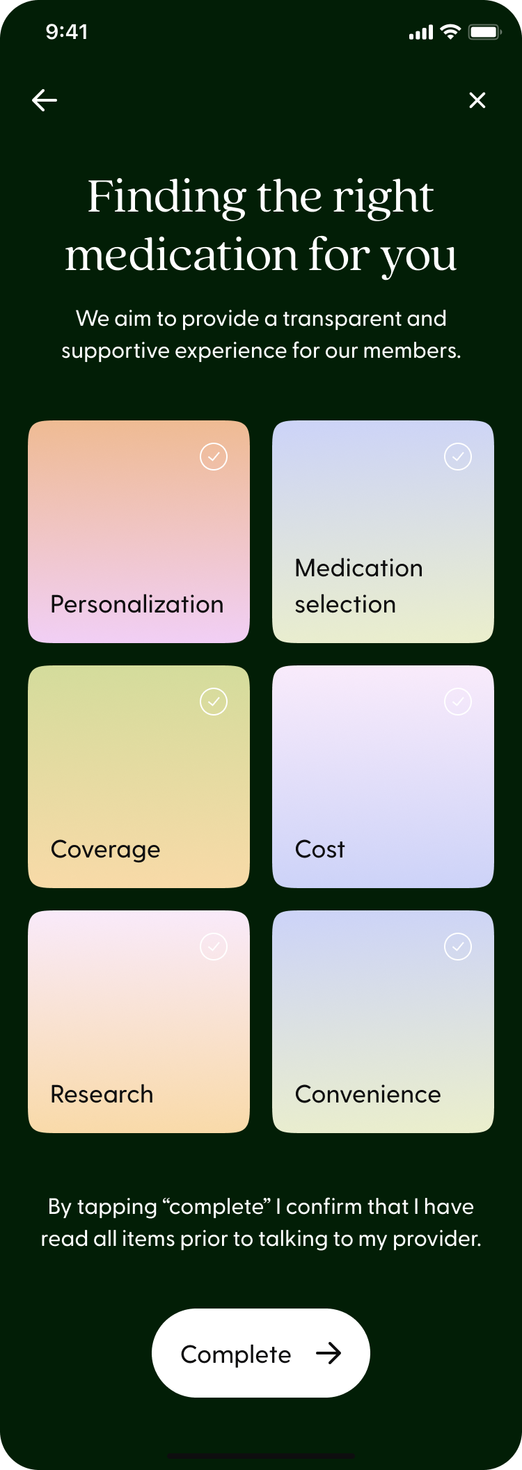
Qualitative testing confirmed that a personalized and transparent approach set better expectations. This design and content was found to be friendly, digestible and encouraged completion.
Discontinuity of Care
Providers, lifecycle and our digital experience were not connected in the way medication details were shared, creating variability in the experience for members. We identified two problem areas that we believed would have the biggest impact: process and continuity.
Process
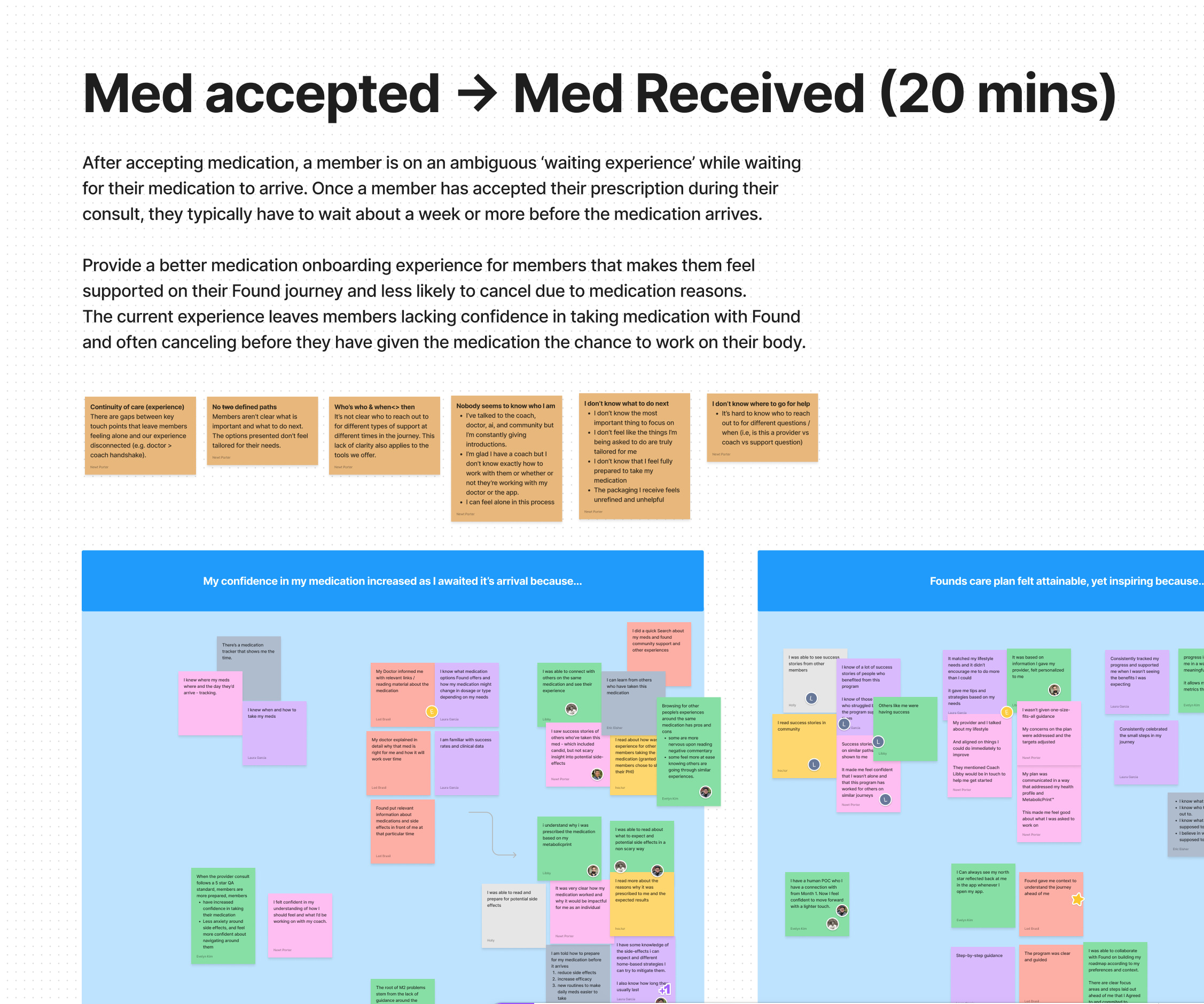
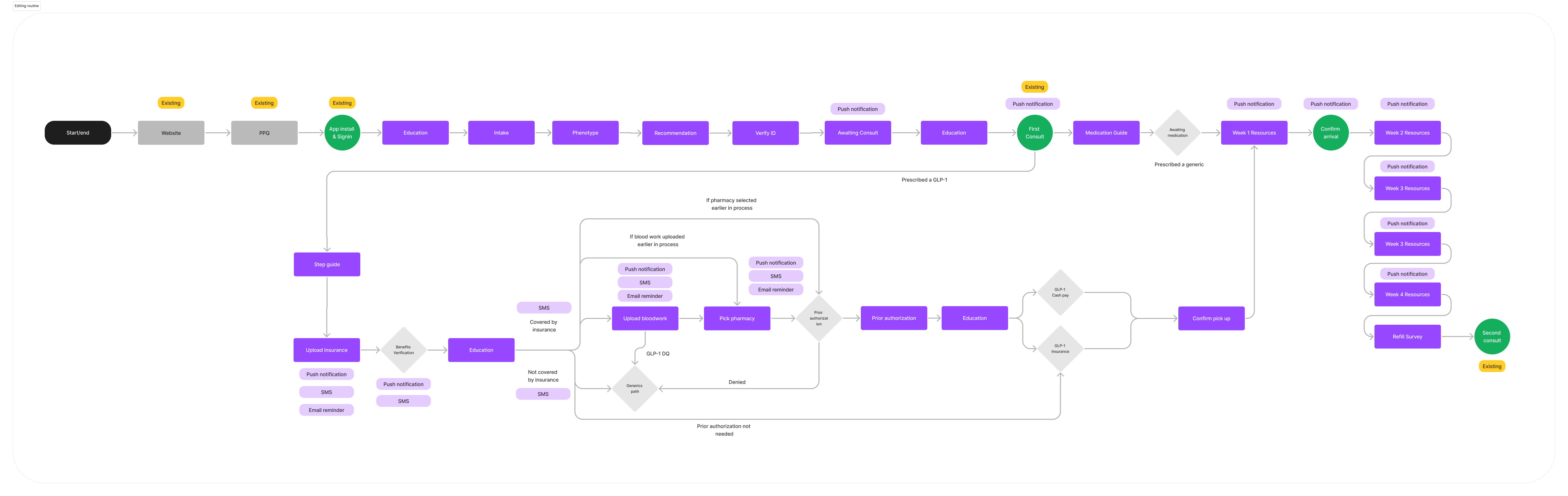
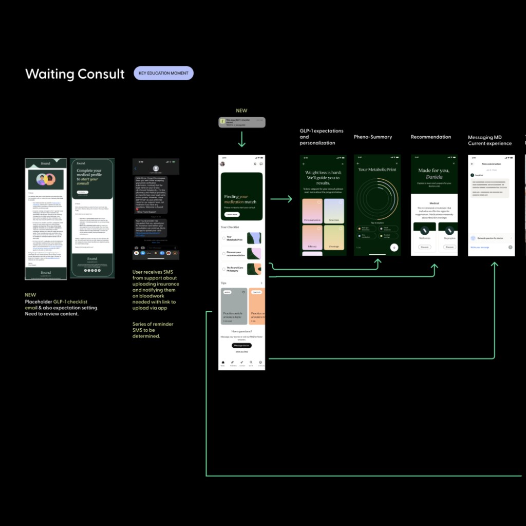
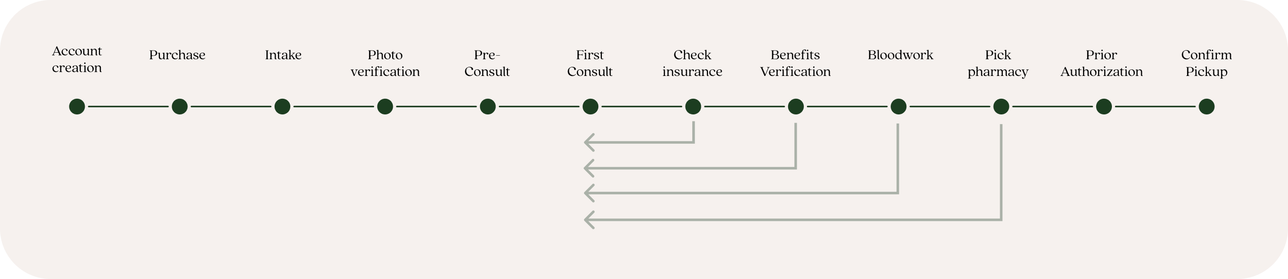
The process of getting a medication requires many steps, especially for GLP-1's which can take up to 21 days. Users were getting stuck in a 'waiting experience' by not completing required actions which created high cancellations and low NPS scores.
Streamline
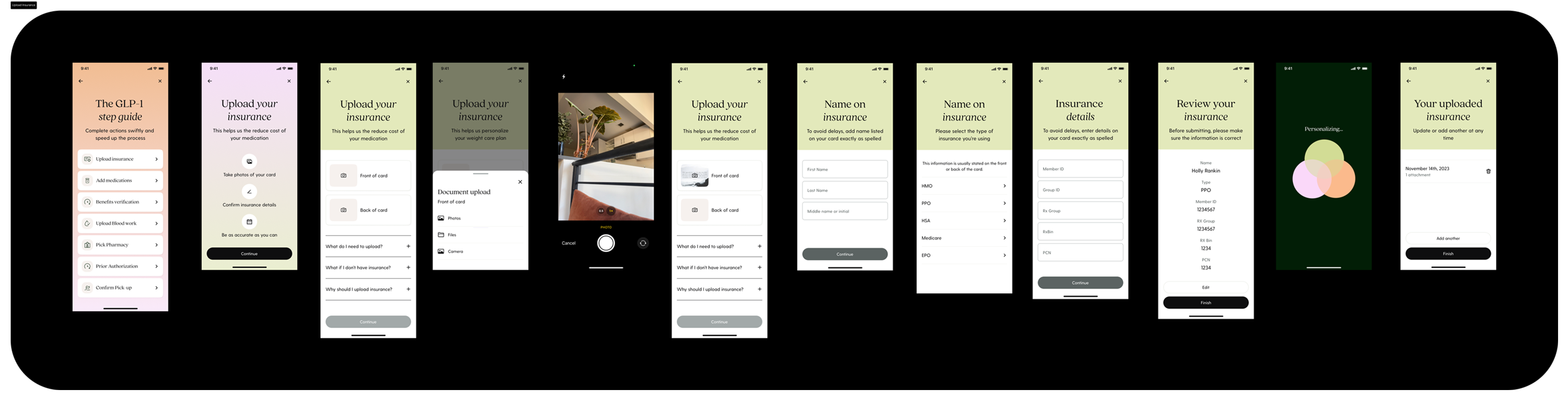
By moving steps earlier in the process reduced time to obtaining a GLP-1 by half. Adding these steps into the app streamlined the experience further.
Communication
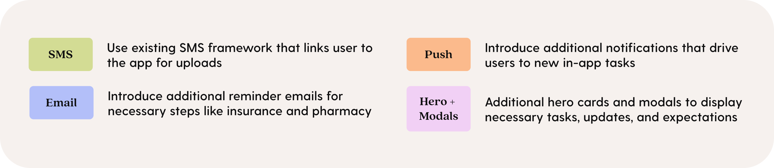
Lifecycle and platform concepts provided additional reminders and tasks in the app to provide greater clarity on what users should be doing.

Creating a persistent GLP-1 step guide enabled users to complete all necessary items sooner, resulting in less waiting time and increased process expectations.
Home
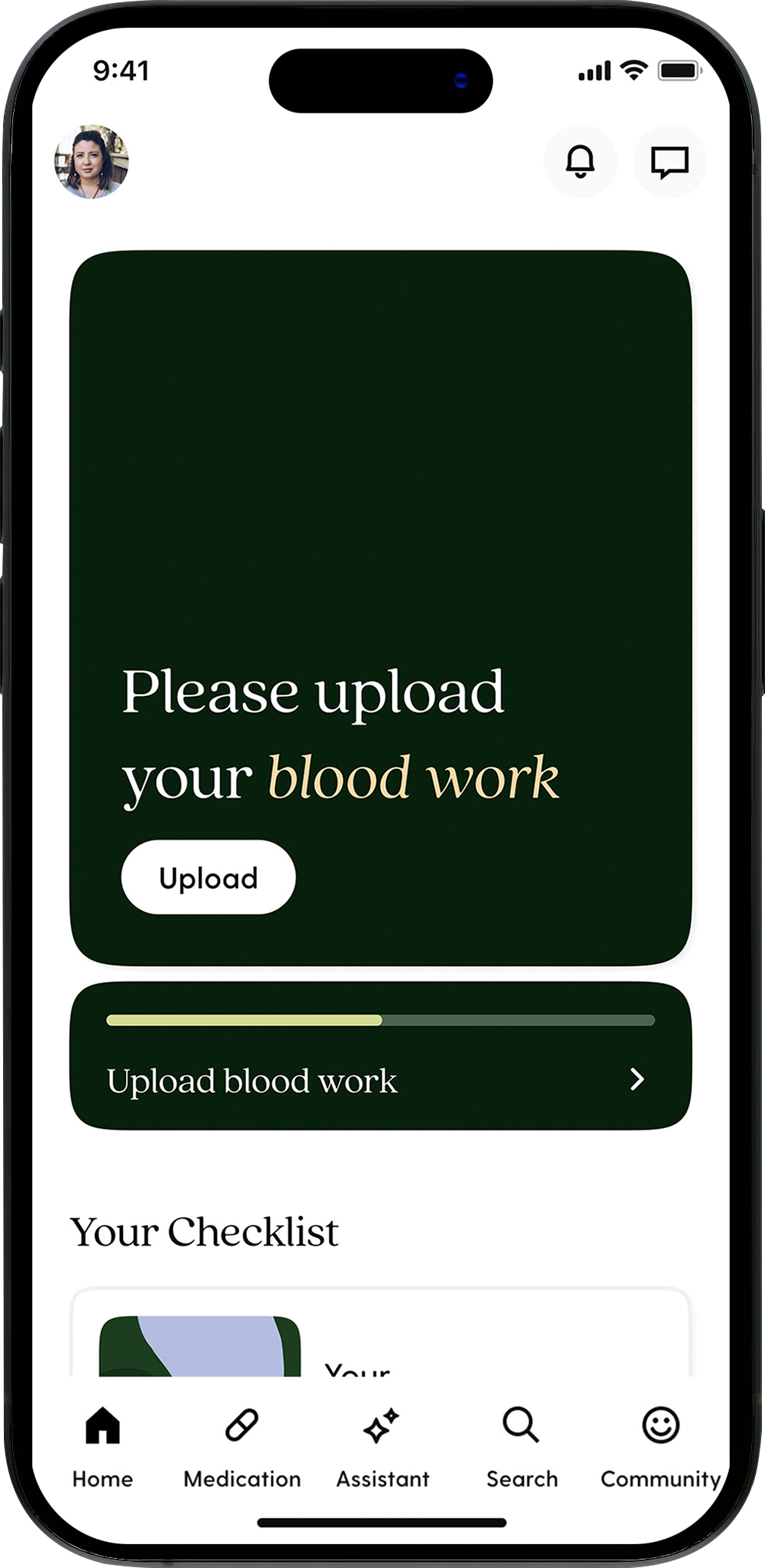
In progress
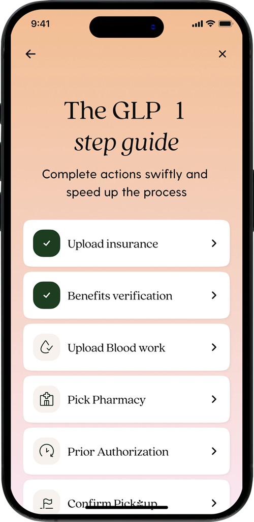
How-to
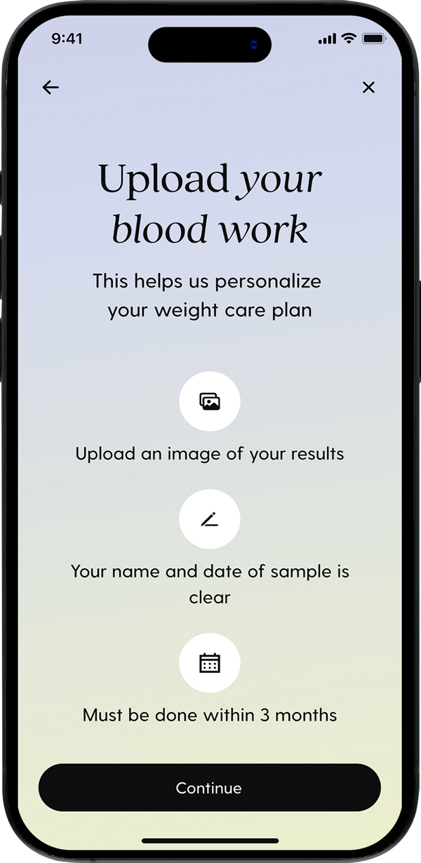
Informational
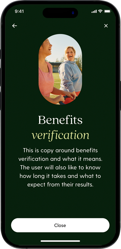
Adding insurance, bloodwork and additional medication flows into the app further streamlined the experience.
Continuity
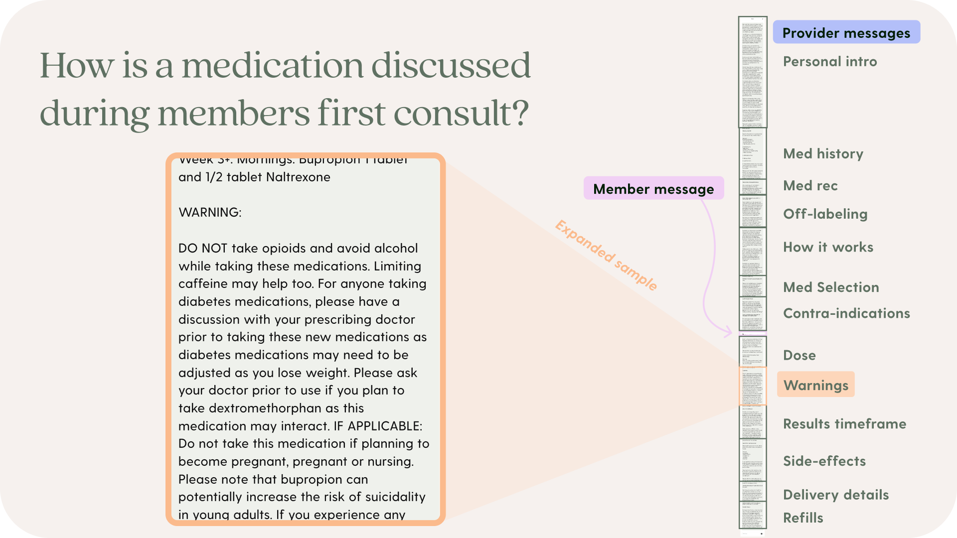
51% of day 1 to day 14 cancellations were related to medication and the first consult. Providers needed ways to consistently communicate and coordinate complex clinical care and members needed to understand and reference clinical guidance and requests.
Progressive
Information was shared to members without progressive disclosure
Access
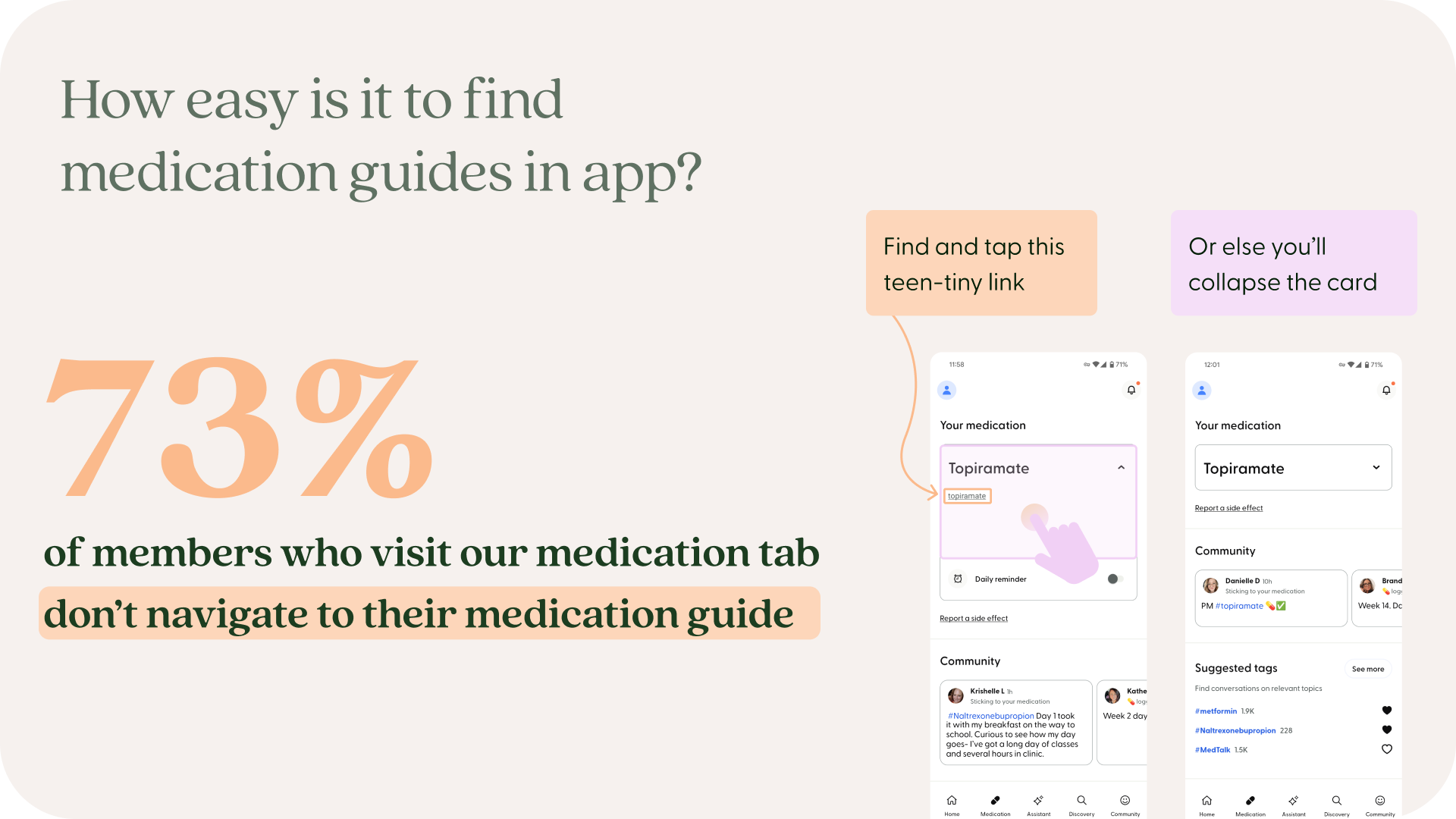
Resources were previously difficult to discover and use.
Progressive
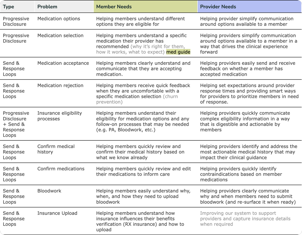
We identified problems users and providers experienced during the consult and identified two areas of focus: progressive disclosure and send & response loops.
Problems
Concepts
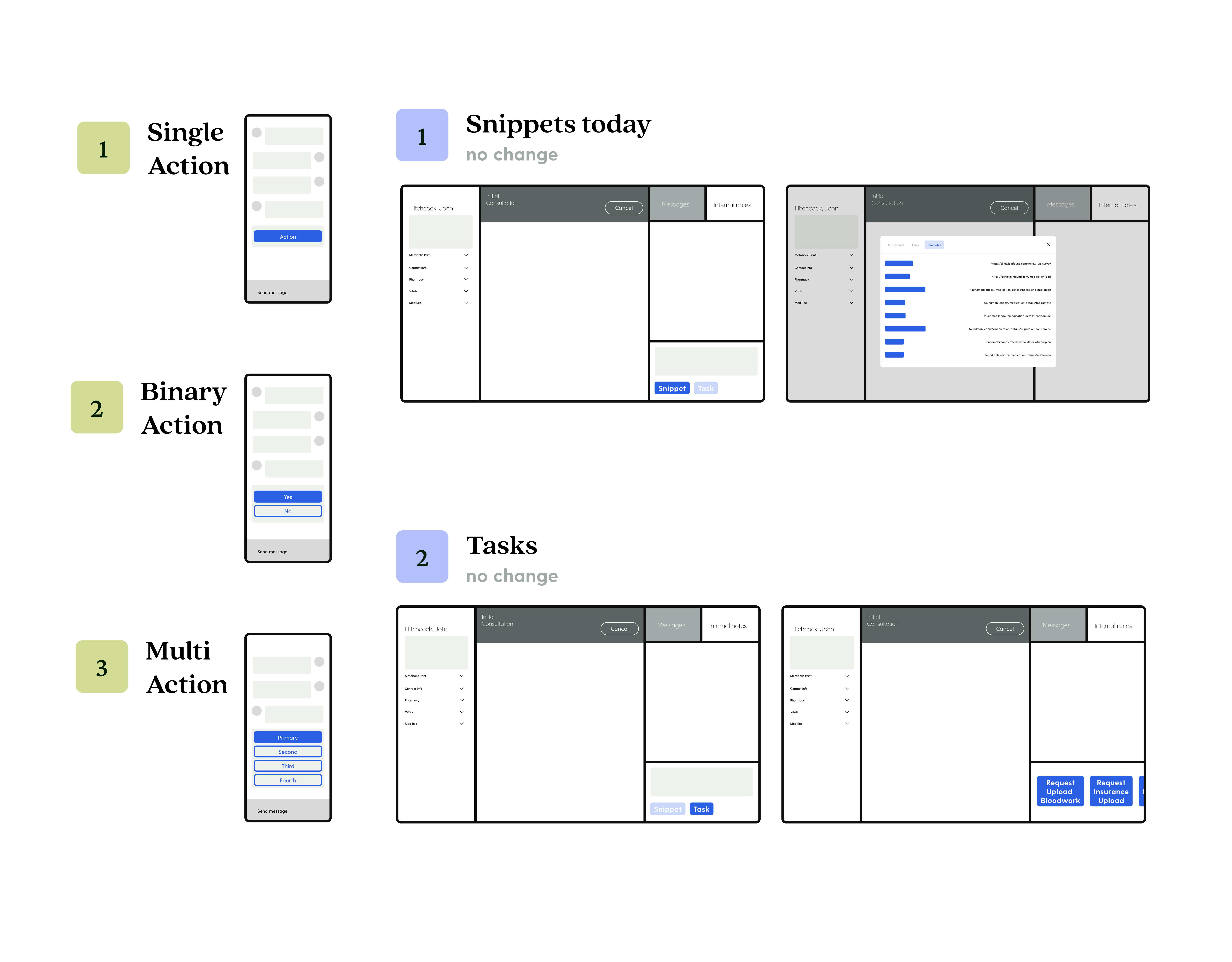
Build one, solve many
Tasks and snippets bridge providers to the mobile app through rich messages that help tighten messages to capture or confirm key information and progressively disclose dense information.
Must read
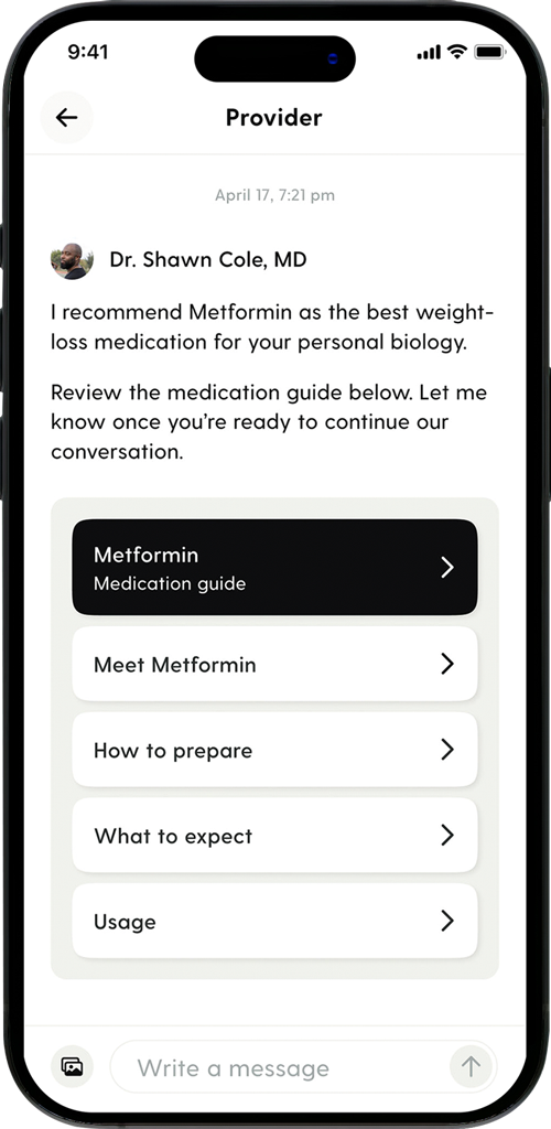
No distractions
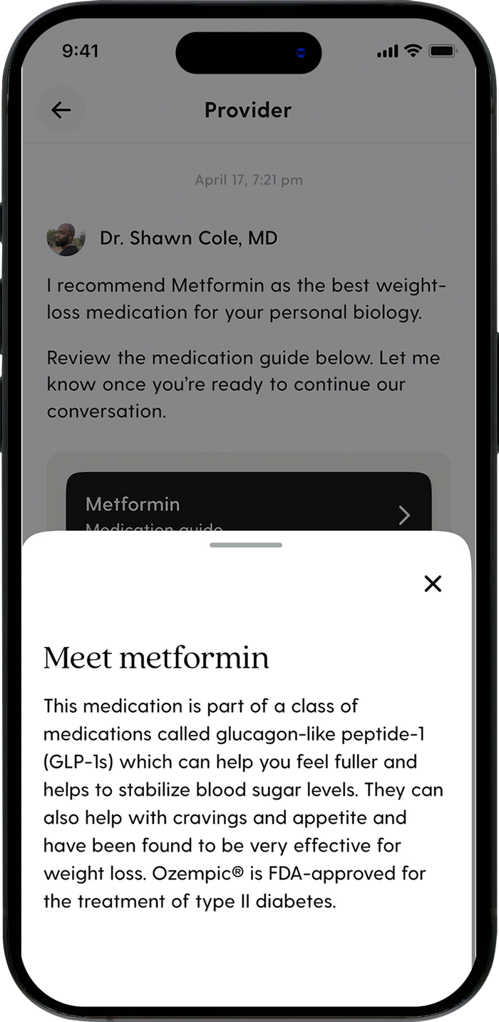
Acceptance
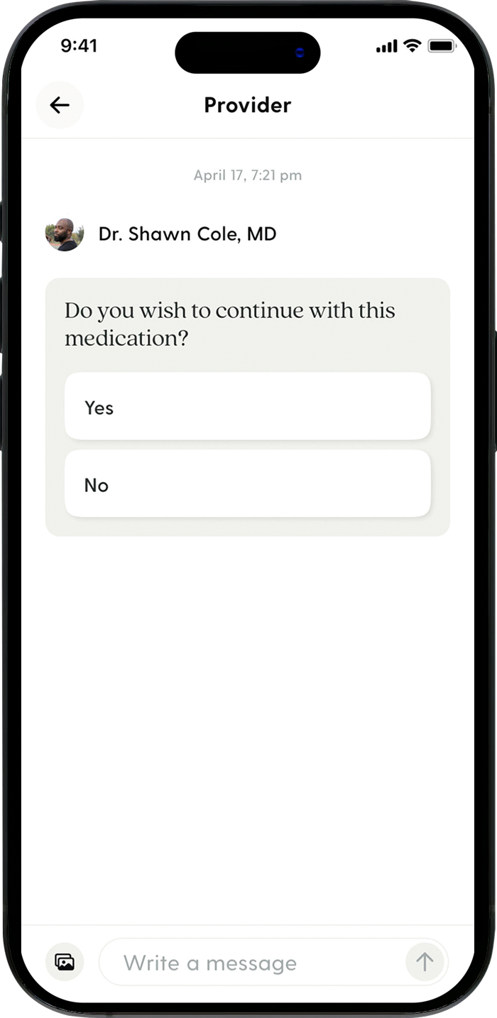
Routing
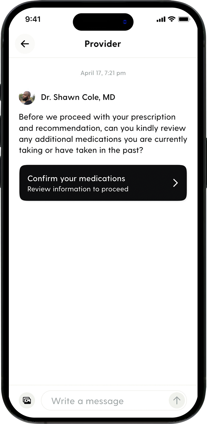
The phased approach to smart messaging decreased consult message length and increase consult rating by 50%.
Access
Existing resources like medication guides were rarely found by members. User research confirmed that those who did interact with the guide did so consistently, proving its value.
Hierarchy
Clear actions and additional high priority items were given top hierarchy.
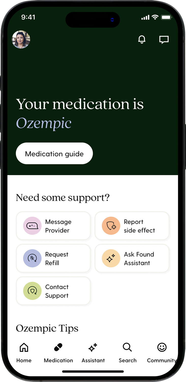
Access
All medication resources were added to the medication home for easy access.
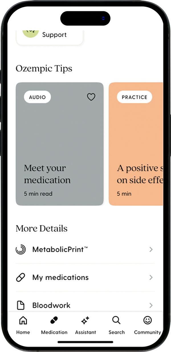
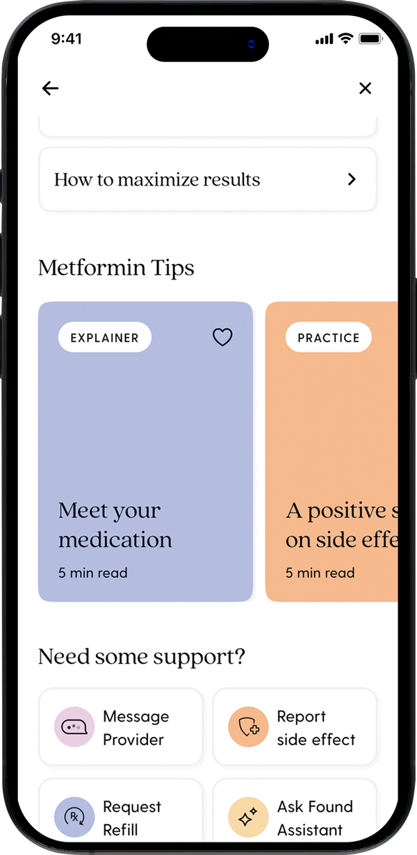
Medication guide
The medication guide was also given a full redesign to increase readability.
Future iterations
Beyond month one
The medication journey doesn't stop at month one. The team will continue building out opportunities to set users up for success.
Side effect mitigation
Discoverability of side effect reporting was solved, but the flow was untouched. The team will be improving this feature to ensure seamless reporting.
Improved resources
The content and design team plan to create more engaging videos and review all content across the consult and journey to better engage users.
AI
Personalized insights on a users health using machine learning and leaning into AI for messaging will reduce the burden on providers and empower users.